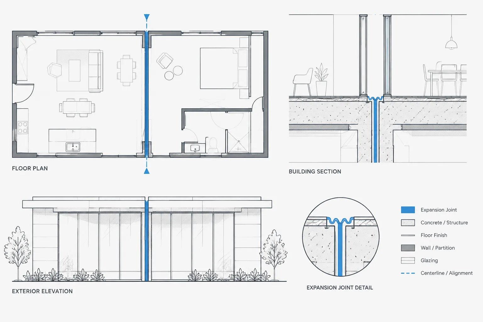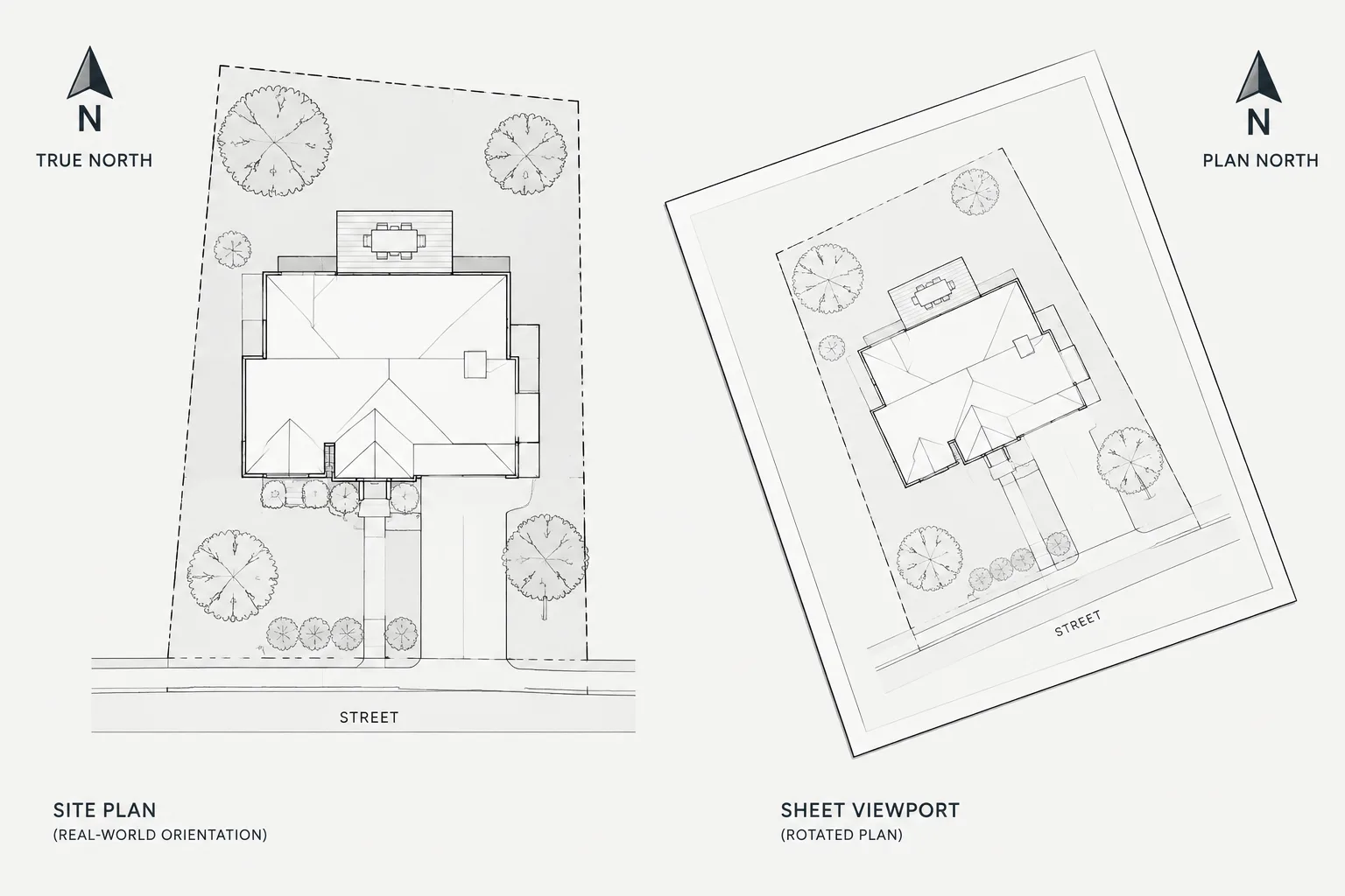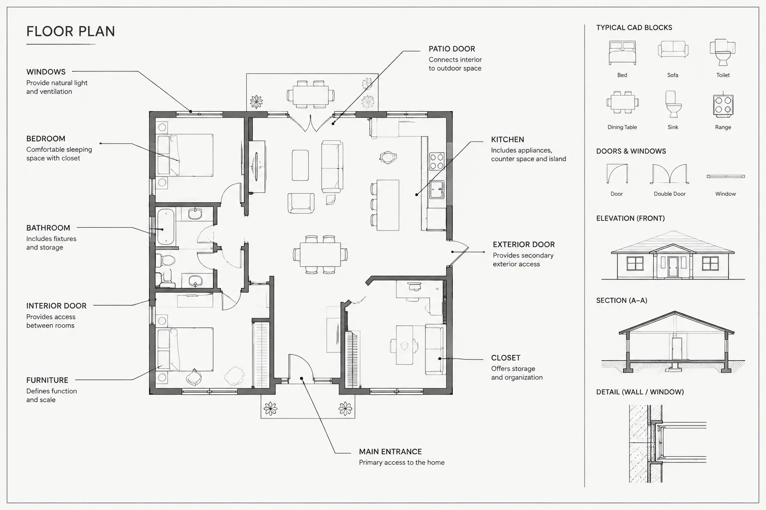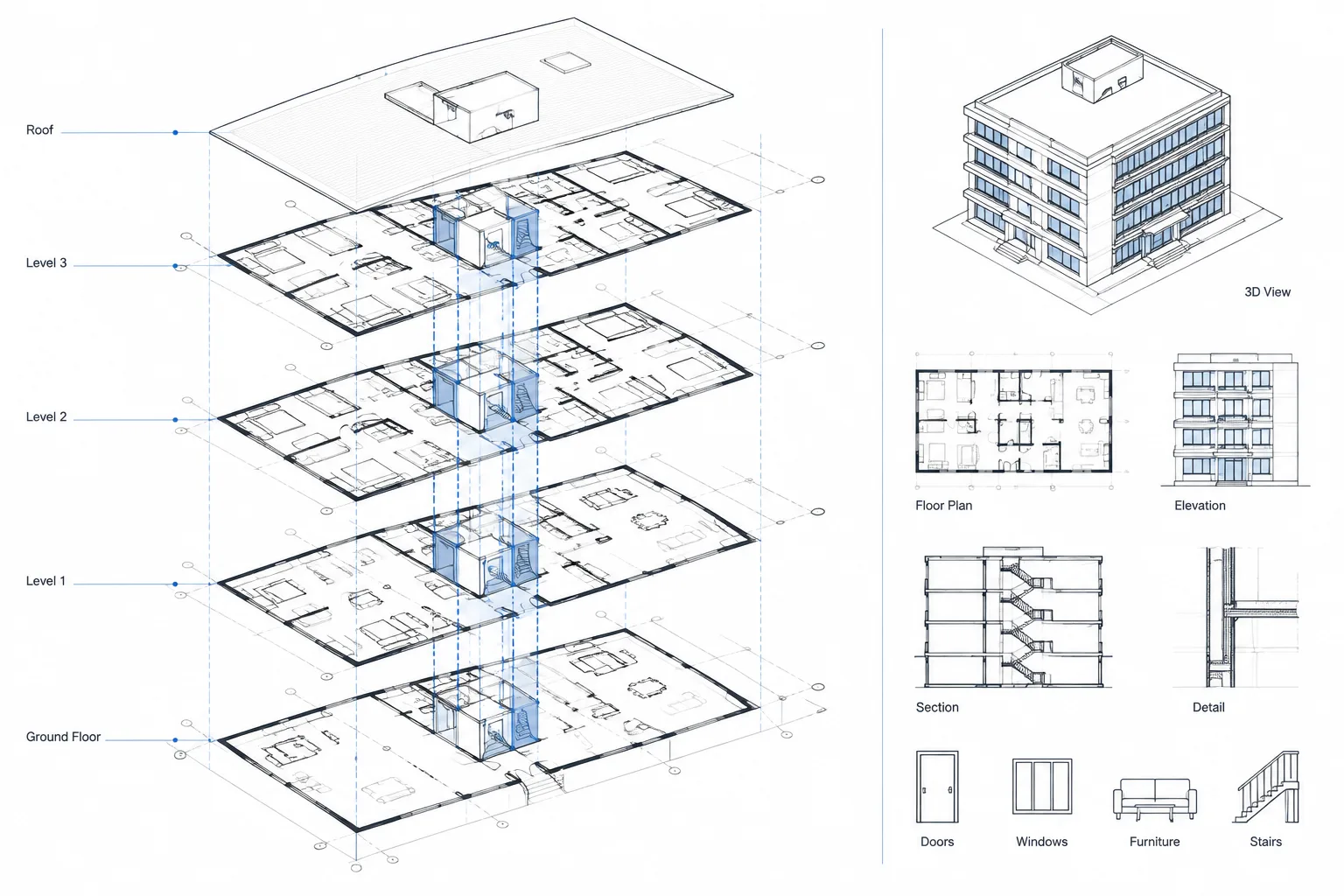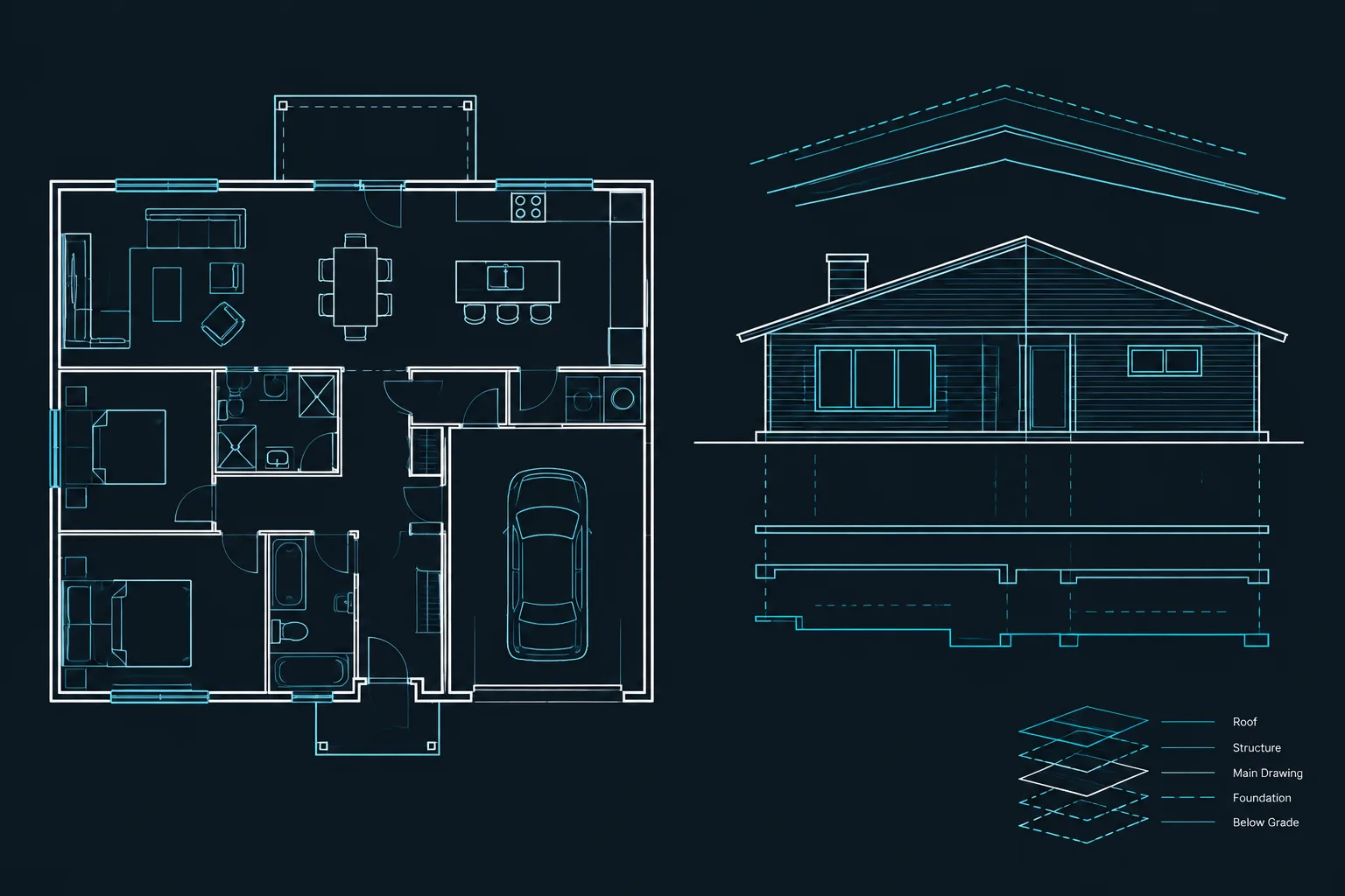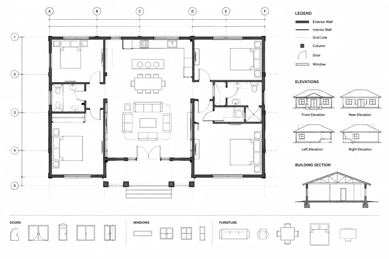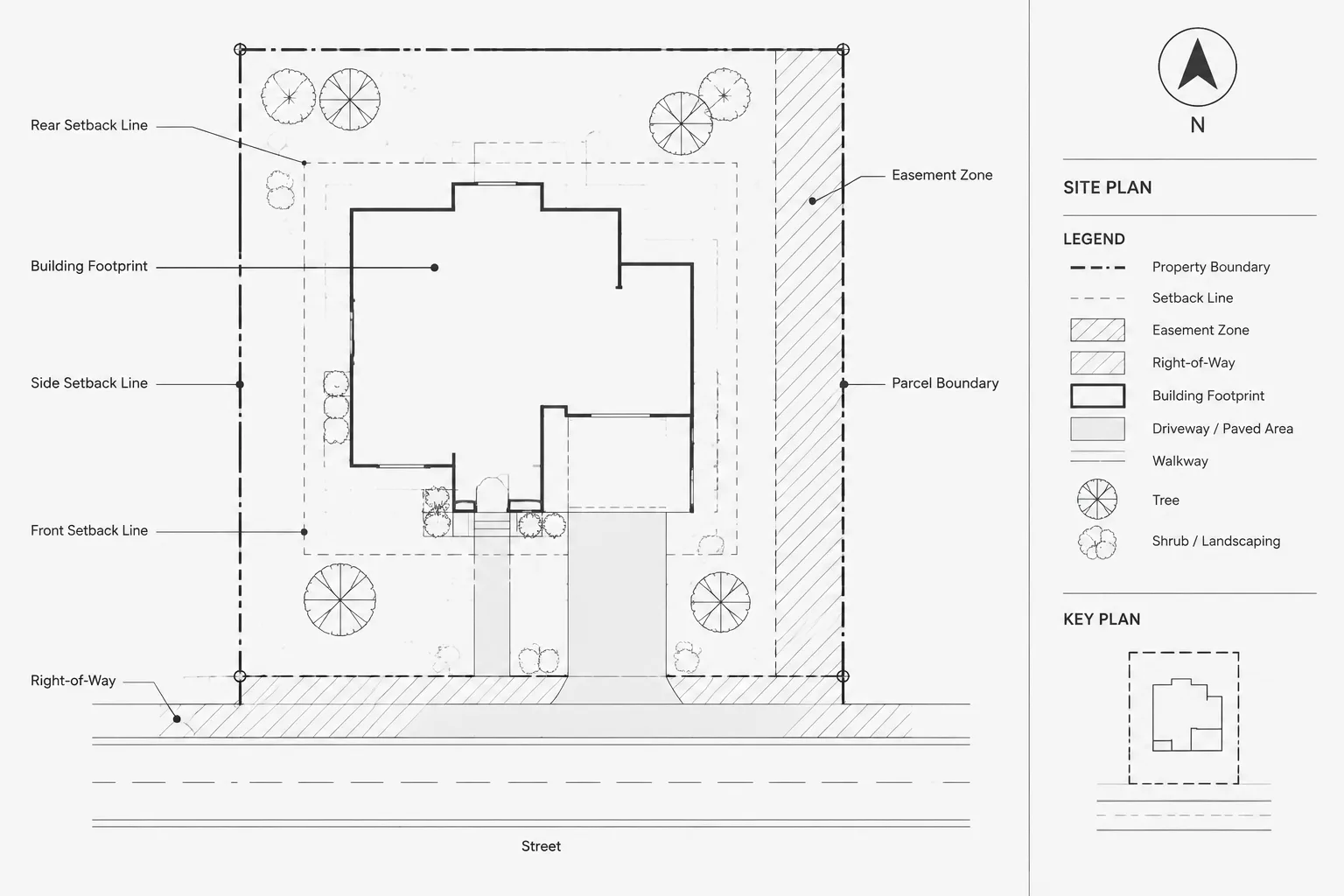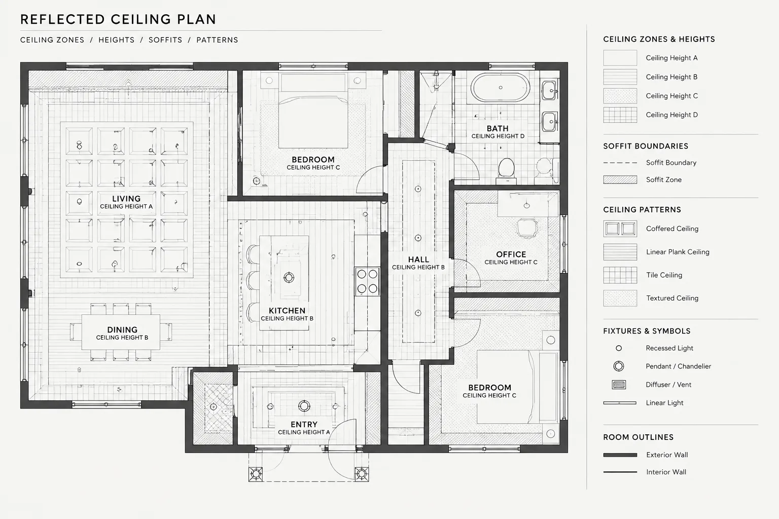
Lineweight hierarchy for architectural elevations and sections is not simply a choice between thick and thin lines. It is a visual system that communicates the cutting plane, building profile, depth, surface information, and annotation before the reader studies individual details.
The most effective CAD workflow begins by classifying what each line means in the view. That distinction helps prevent cut construction, distant geometry, material patterns, and reference graphics from merging into an undifferentiated drawing. The guidance below explains how to organize those roles, manage them through CAD properties, and evaluate the result at its intended output.
Architectural elevations and sections can contain accurate geometry yet still be difficult to read. The usual problem is not missing information but a weak graphic hierarchy: cut elements, foreground profiles, distant surfaces, material patterns, and annotations all compete at the same visual strength.
A reliable lineweight strategy helps the reader understand what is cut, what is closest, what is farther away, and what is merely surface information. It also makes drawings more useful when printed, reduced, exported to PDF, or viewed alongside consultant sheets.
There is no single lineweight assignment that fits every office, plot style, or sheet scale. The practical goal is to create a limited, repeatable hierarchy and verify it through plotted output rather than relying only on the model-space display.
Start with graphic meaning, not object type
A common drafting mistake is to assign one lineweight to all walls, another to all windows, and another to all roofs. That approach may work in a simple elevation, but it breaks down in a section because the same object can appear in several graphic conditions.
For example, a wall may be:
- Cut by the section plane.
- Seen in elevation immediately beyond the cut.
- Visible in the background across a larger space.
- Represented only by a finish joint or surface pattern.
- Shown overhead, below, or beyond with a special linetype.
These conditions should not necessarily look alike. Assign graphic weight according to how the element is being represented in the view, not merely according to what the element is.
A practical hierarchy for elevations and sections
The categories below provide a useful starting framework. Their actual plotted weights should follow the project CAD standard, sheet scale, and output method.
| Graphic category | Typical content | Visual role |
|---|---|---|
| Section cut | Walls, floors, roofs, foundations, and other construction intersected by the cutting plane | Strongest linework, clearly distinguishing cut construction from elements beyond |
| Primary profile | Building silhouette, major openings, prominent edges, and foreground forms | Defines the principal shape of the building or space |
| Secondary edges | Recesses, projections, frames, trim, and intermediate-depth elements | Explains form without competing with the main profile |
| Background geometry | Distant walls, adjacent buildings, landscape, or elements seen through openings | Provides context and depth with reduced emphasis |
| Surface information | Material joints, panels, finish patterns, and fine detail | Communicates texture or assembly without defining the overall form |
| Annotation | Dimensions, levels, tags, leaders, and reference symbols | Remains readable while staying separate from modeled geometry |
Not every drawing needs every category. A small interior elevation may use only a few levels, while a complex building section may require a more developed depth hierarchy.
Section cuts should read immediately
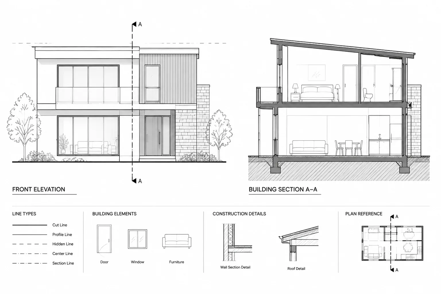
In a building or wall section, the reader should be able to identify the cutting plane at a glance. Construction intersected by that plane normally receives the strongest outline treatment. A cut floor edge should not disappear among finish lines, ceiling grids, furniture, or distant elevation geometry.
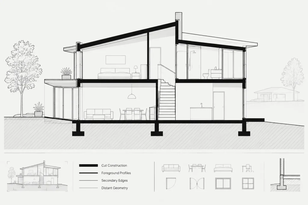
Keep cut outlines continuous where possible. Gaps caused by overlapping hatches, masking objects, duplicate linework, or poorly trimmed references can weaken the section. At junctions, review whether the cut boundary accurately describes the assembly rather than simply tracing every internal layer with equal emphasis.
Poche can reinforce cut construction, but it should not be used to conceal unresolved geometry. Whether the office uses solid fill, material-specific hatching, or a combination, the cut perimeter still needs to remain clear.
Use profile lines to organize elevations
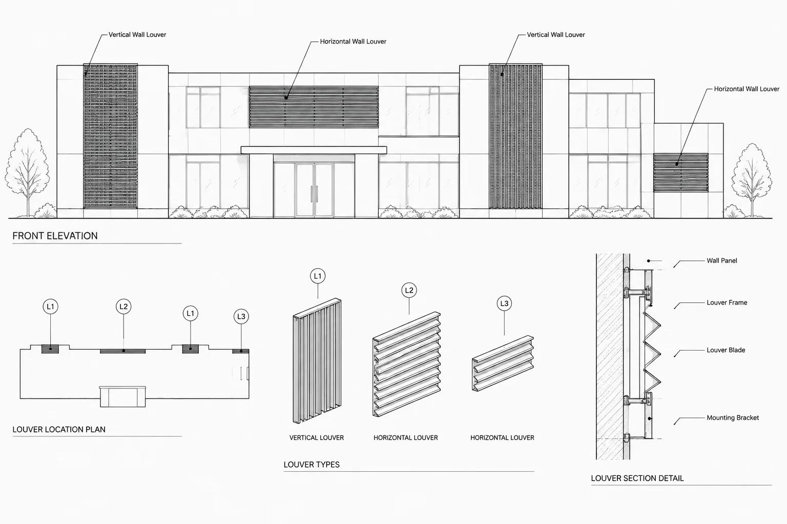
Exterior elevations usually do not contain the same amount of cut construction as sections, so the building profile becomes especially important. The roof edge, outside corners, major setbacks, and perimeter of large openings help establish the overall form.
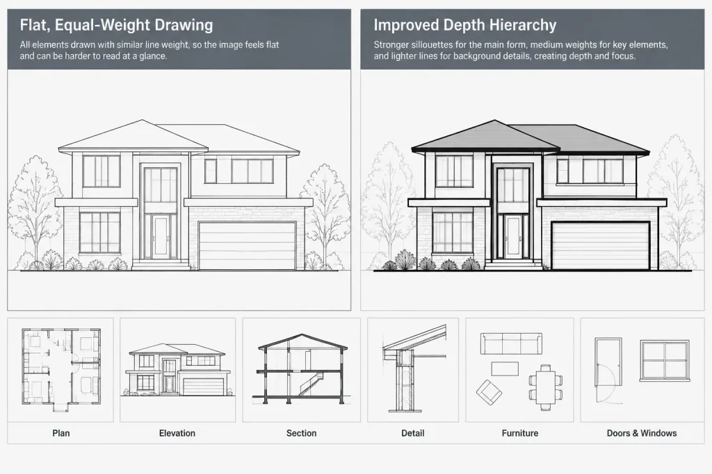
Avoid outlining every component with the same heavy line. If window muntins, cladding joints, wall corners, and the building silhouette all plot equally, the elevation becomes flat and visually noisy. Reserve stronger lines for the edges that define massing and major changes in plane.
Some edges change importance along their length. A canopy may form a strong silhouette at its exposed edge but require a lighter line where it meets the wall. Splitting linework by graphic condition is often more effective than forcing the entire object onto one presentation layer.
Create depth without excessive detail
Depth is communicated by relative contrast. Foreground elements generally read darker or stronger, while distant elements become lighter and simpler. This principle is useful in both exterior elevations and long building sections.
Consider reducing the emphasis of:
- Walls and openings across distant rooms.
- Adjacent buildings included for context.
- Landscape behind the primary facade.
- Objects viewed through glazing.
- Secondary structure beyond the section plane.
- Repeated components that would otherwise create dense bands of linework.
Depth should not depend entirely on grayscale screening. A controlled combination of lineweight, line density, hatch intensity, and selective omission is often more robust. If every distant object is retained at full detail, making it lighter may still leave the drawing cluttered.
Control hatches and material patterns
Material hatches can explain where assemblies change, but they should remain subordinate to cut boundaries and important edges. Dense patterns may merge when printed or reduced, while overly prominent facade joints can overpower windows and profiles.
Before applying a pattern, decide what it needs to communicate. A hatch may indicate a cut material, a finish zone, a panel layout, or a general surface texture. These are different purposes and may require different layers or graphic treatments.
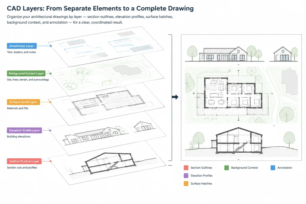
Use hatch boundaries that can be reviewed and edited. Small gaps, duplicate loops, and fragmented geometry can make patterns unreliable. In complicated sections, separate the outline work from the hatch objects so each can be controlled without altering the other.
Coordinate lineweights through layers and properties
A maintainable DWG should make the hierarchy understandable to another drafter. Use layers or another documented property system to distinguish cut work, profiles, secondary edges, background information, surface patterns, and annotations.
Keep object properties consistent with the project plotting method. Unexplained object-level overrides can produce the correct appearance temporarily but make later revisions difficult. If an exception is necessary, use it deliberately and check that it remains visible in the relevant viewport.
Viewport layer overrides can help when the same model geometry appears differently on separate sheets. However, they should not become a substitute for a coherent base-layer structure. Record unusual sheet-specific treatments so they are not accidentally removed during cleanup.
Separate geometry from annotation hierarchy
Lineweight hierarchy also applies to text and symbols. Level markers, section references, detail callouts, dimensions, and notes must be readable without looking like building edges.
Coordinate annotation through established text, dimension, and multileader styles rather than manually changing individual objects. Check that marker outlines, extension lines, leaders, and text retain a balanced relationship after plotting. Reference symbols should be easy to locate, but they should not obscure the geometry they identify.
Where annotations cross dense portions of a drawing, consider repositioning them or simplifying the nearby linework. Masking can be useful, but excessive masking may hide construction that another reader expects to see.
Review the drawing at its intended output
Lineweight cannot be judged reliably from a zoomed-in model-space view. Screen display settings, monitor resolution, plot styles, transparency, and PDF processing can all affect the result.
A practical review sequence is:
- Confirm that objects use the intended layers and properties.
- Preview the sheet with the correct page setup and plot style.
- Review the entire sheet at a normal reading size.
- Inspect dense junctions, glazed areas, hatches, and overlapping references.
- Check a PDF rather than relying only on plot preview.
- Print a representative portion when final output quality is important.
- Repeat the check after reducing or combining sheets if that is part of delivery.
A drawing that looks refined at a large scale may lose its hierarchy when placed on a smaller sheet. Conversely, a strong cut line that works in a wall detail may be visually excessive in a broad building section.
Common lineweight problems
Everything plots with equal strength
Check for object overrides, incorrect plot-style mapping, layers that share the same output property, or a viewport configuration that is flattening the intended differences.
The section cut is lost in hatching
Reduce the visual strength of the hatch, verify draw order, and restore a continuous cut perimeter. Also check for duplicate outlines that may plot unpredictably.
The elevation looks flat
Strengthen the primary silhouette and major plane changes, then reduce distant geometry and repetitive surface lines. Adding more detail rarely solves a depth problem.
Backgrounds overpower the architectural drawing
Place contextual or consultant information on controllable layers. Simplify it where appropriate and confirm that the resulting drawing still communicates necessary coordination information.
Lineweights work in one viewport but not another
Compare viewport overrides, scale, plot settings, and layer visibility. Do not assume that matching model-space geometry will automatically produce matching sheet graphics.
Final quality-control checklist
- Can the reader identify cut construction immediately?
- Does the main building or room profile stand out?
- Are foreground, middle-ground, and background elements distinguishable?
- Are material patterns subordinate to outlines?
- Do windows, doors, and openings retain clear edges?
- Are annotations readable without competing with geometry?
- Have object-level property overrides been minimized or documented?
- Does the hierarchy survive PDF export and normal-size viewing?
- Are similar views presented consistently across the drawing set?
A strong elevation or section does not need many different lineweights. It needs a small number of meaningful levels applied consistently. When cut, profile, depth, surface, and annotation graphics each have a clear role, the drawing becomes easier to read, coordinate, revise, and issue.
A useful decision test for every line
When a drawing becomes visually crowded, ask what the line is expected to communicate. Is it showing an intersection with the section plane, defining a visible silhouette, describing a change in depth, indicating a surface joint, or supporting an annotation? If its purpose is unclear, the line may be unnecessary, duplicated, or assigned to the wrong graphic category.
This purpose-based test is especially helpful when cleaning imported backgrounds, consultant references, and model-generated views. These sources may contain geometrically valid edges that do not deserve equal emphasis in the architectural presentation. Editing their display does not necessarily mean removing useful coordination information; it means separating essential form from supporting context.
Apply hierarchy as a drawing-set system
A successful hierarchy should remain recognizable across related elevations and sections. Similar graphic conditions should receive similar treatment so readers do not need to reinterpret the drawing language on every sheet.
- Define roles first: Identify cut work, profiles, depth edges, surface information, and annotation before adjusting individual objects.
- Control repeated conditions: Use documented layers, properties, and styles wherever the same condition occurs throughout the set.
- Reserve overrides for exceptions: Local changes are useful when an edge changes graphic meaning, but unexplained overrides make later editing less reliable.
- Review relationships: Judge each category against the lines around it rather than evaluating it in isolation.
- Test the issued format: Confirm that the hierarchy remains clear after plotting, PDF export, and any required sheet reduction.
Diagnose hierarchy before adding detail
If an elevation or section feels incomplete, the problem may be contrast rather than missing geometry. Adding more joints, patterns, outlines, or modeled edges can make the drawing harder to understand. First verify that the cut plane, principal profile, major recesses, and background are visually separated.
A useful review method is to look away briefly and then return to the full sheet. The cut or principal silhouette should register before minor material information. Next, the eye should recognize major openings and changes in plane. Fine patterns and notes should become apparent only when the reader looks more closely.
Coordinate graphic cleanup with drawing intent
Lineweight decisions should support the purpose of the view. A section intended to explain spatial relationships may need stronger depth separation, while an elevation focused on facade organization may rely more heavily on profiles, openings, and controlled surface joints. The same model geometry can therefore require different presentation treatment in different viewports.
Before issuing the drawing, confirm that simplification has not removed information needed for coordination or construction understanding. Graphic clarity is not achieved by hiding every complex condition; it comes from deciding which conditions must lead, which should support, and which can be omitted from that particular view.
Frequently asked questions
Should every wall use the same lineweight in an elevation or section?
No. A wall cut by the section plane has a different graphic role from a wall seen beyond it. The appropriate treatment depends on how the wall appears in the view, not only on its object type.
Why does a CAD section look clear on screen but muddy in a PDF?
Model-space display does not fully represent plotted output. Plot-style mapping, hatch density, transparency, overlapping objects, viewport settings, and PDF processing can alter the apparent hierarchy. Review the configured sheet and exported file.
Should hatches be lighter than section outlines?
Hatches should generally remain subordinate to the boundaries and edges they help explain. Their exact treatment depends on whether they represent cut material, surface finish, panel organization, or another drawing purpose.
How can an elevation be made to look less flat?
Emphasize the primary silhouette and major changes in plane, then reduce the prominence of distant geometry and repetitive surface lines. Depth usually improves through controlled contrast rather than additional detail.
Are object-level lineweight overrides acceptable?
They can be useful for deliberate exceptions, particularly where an edge changes meaning along its length. However, repeated or undocumented overrides make a DWG harder to revise and troubleshoot. Use a consistent layer and property system for recurring conditions.
What should be checked when lineweights differ between viewports?
Compare viewport layer overrides, visible layers, plotting configuration, view scale, and object properties. Also check whether referenced drawings or annotations are receiving sheet-specific treatment.