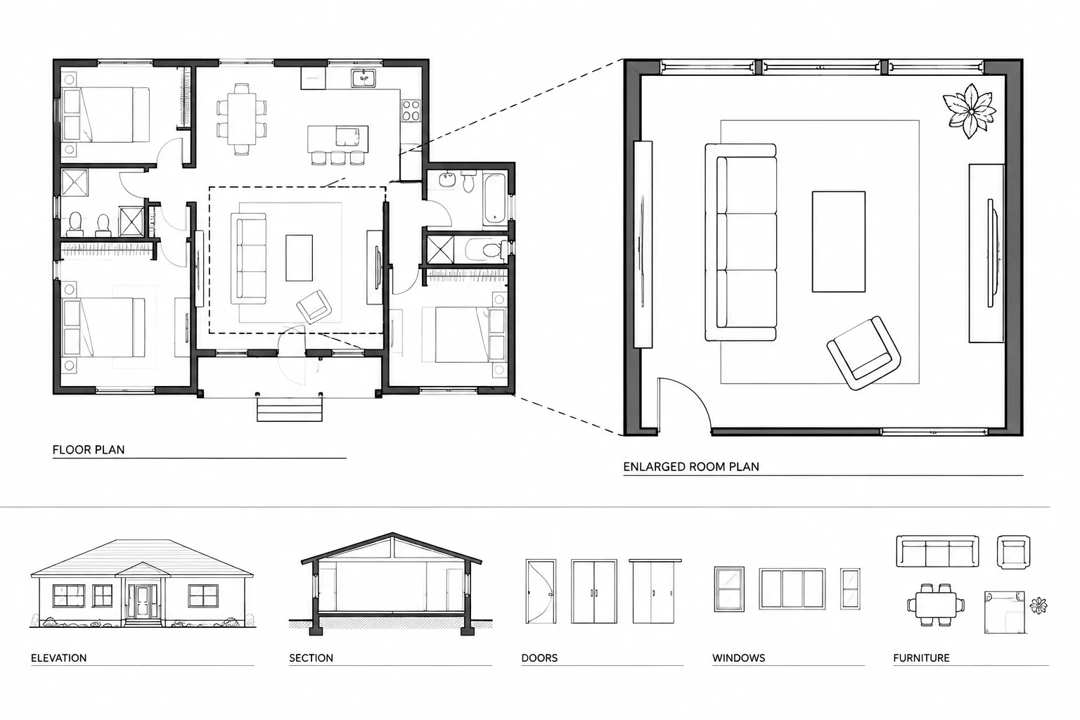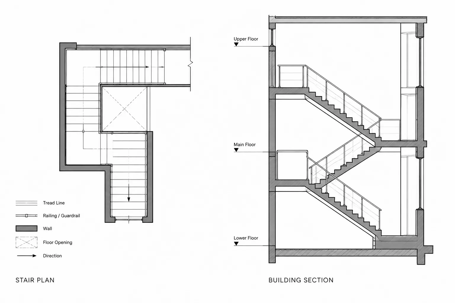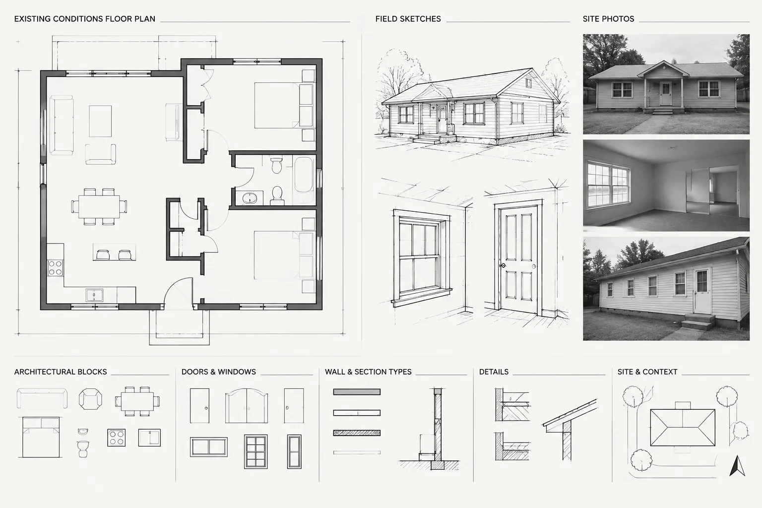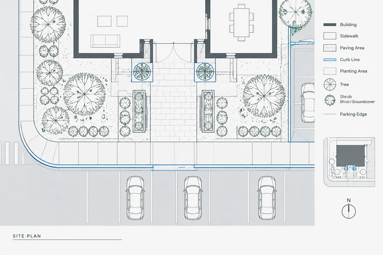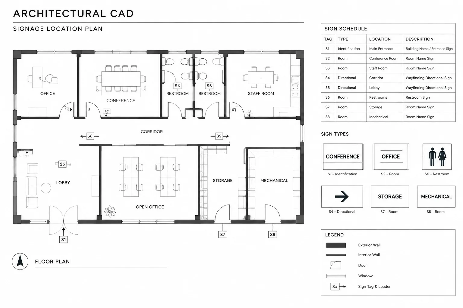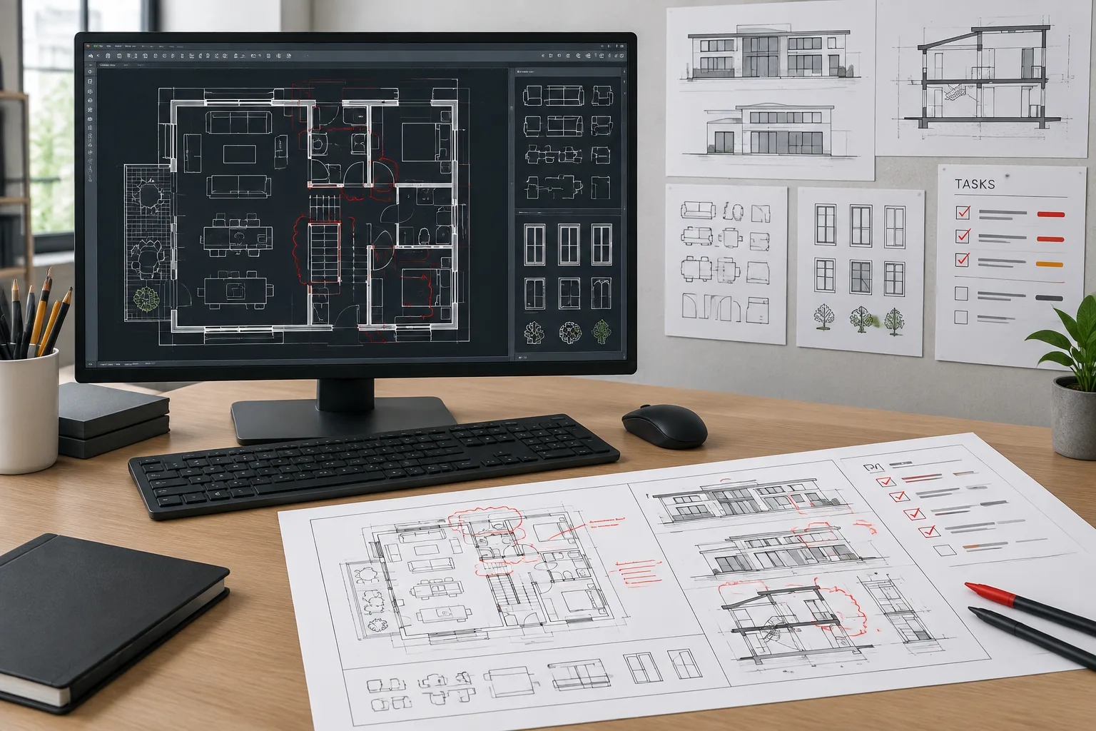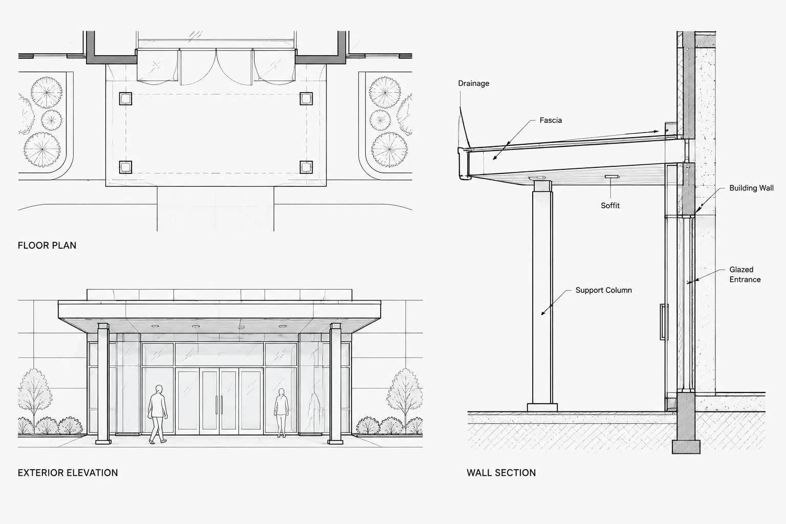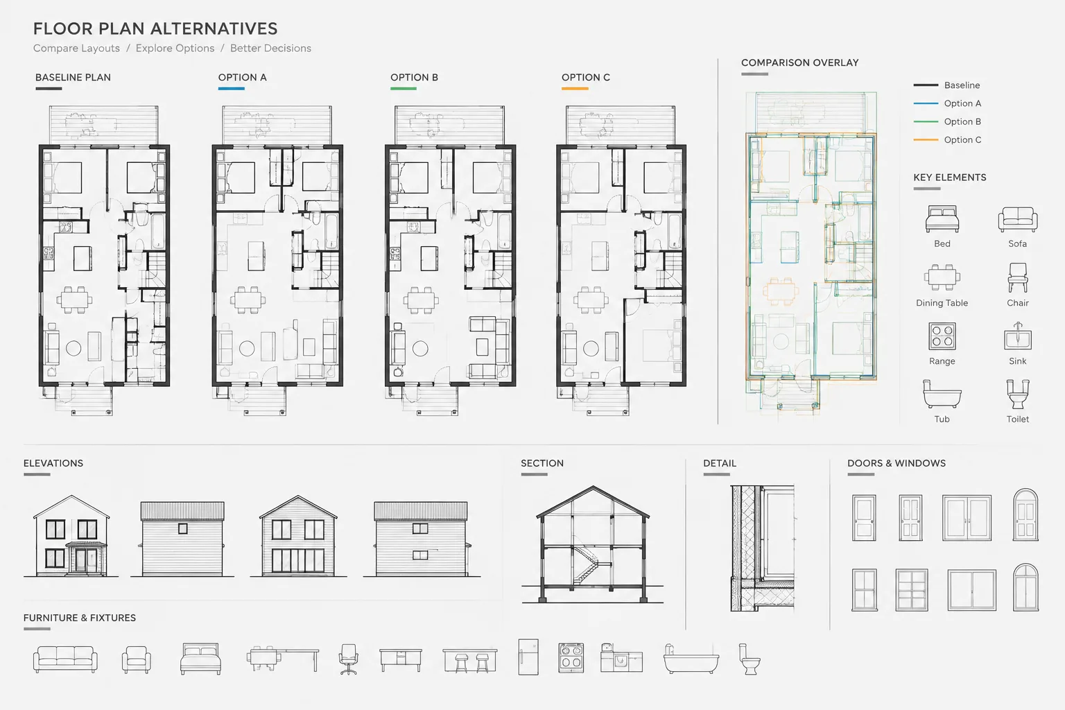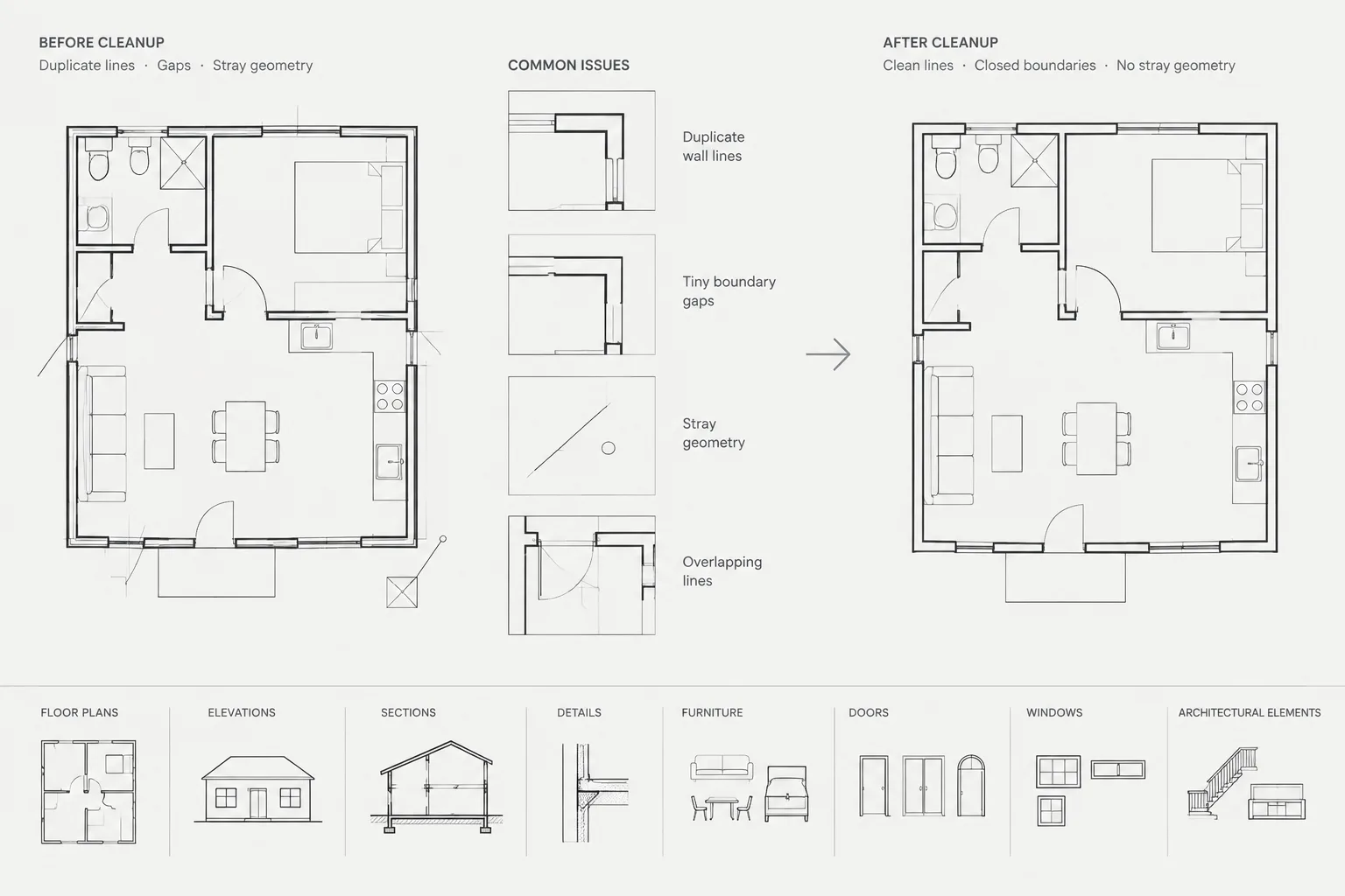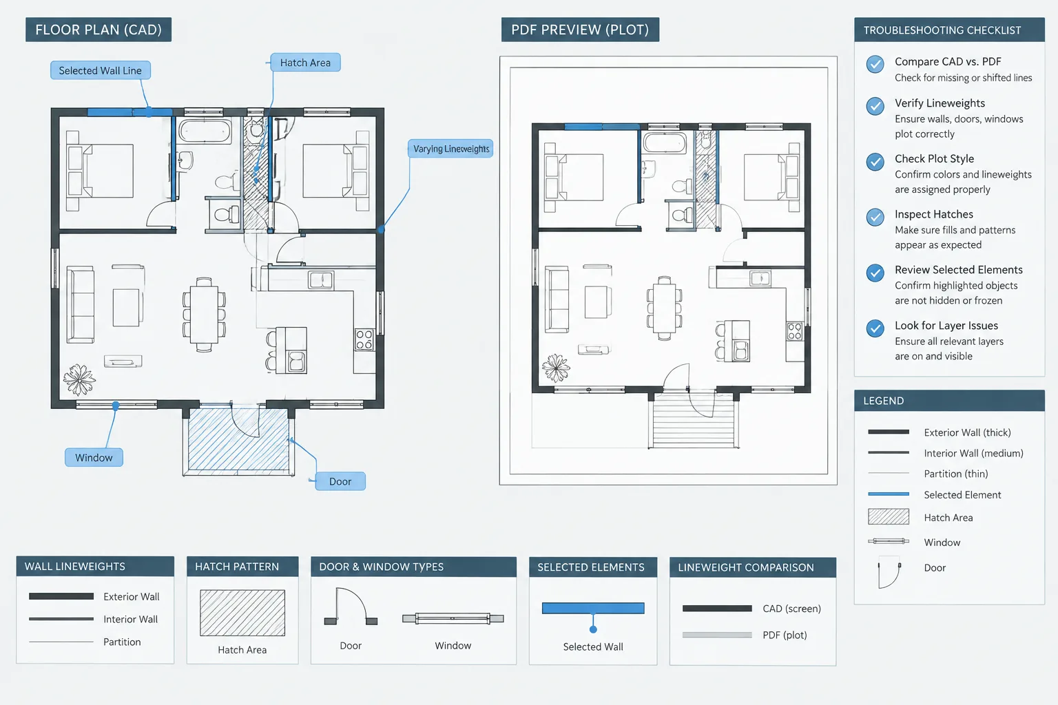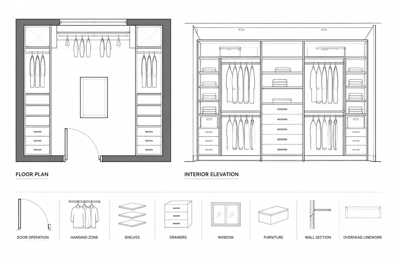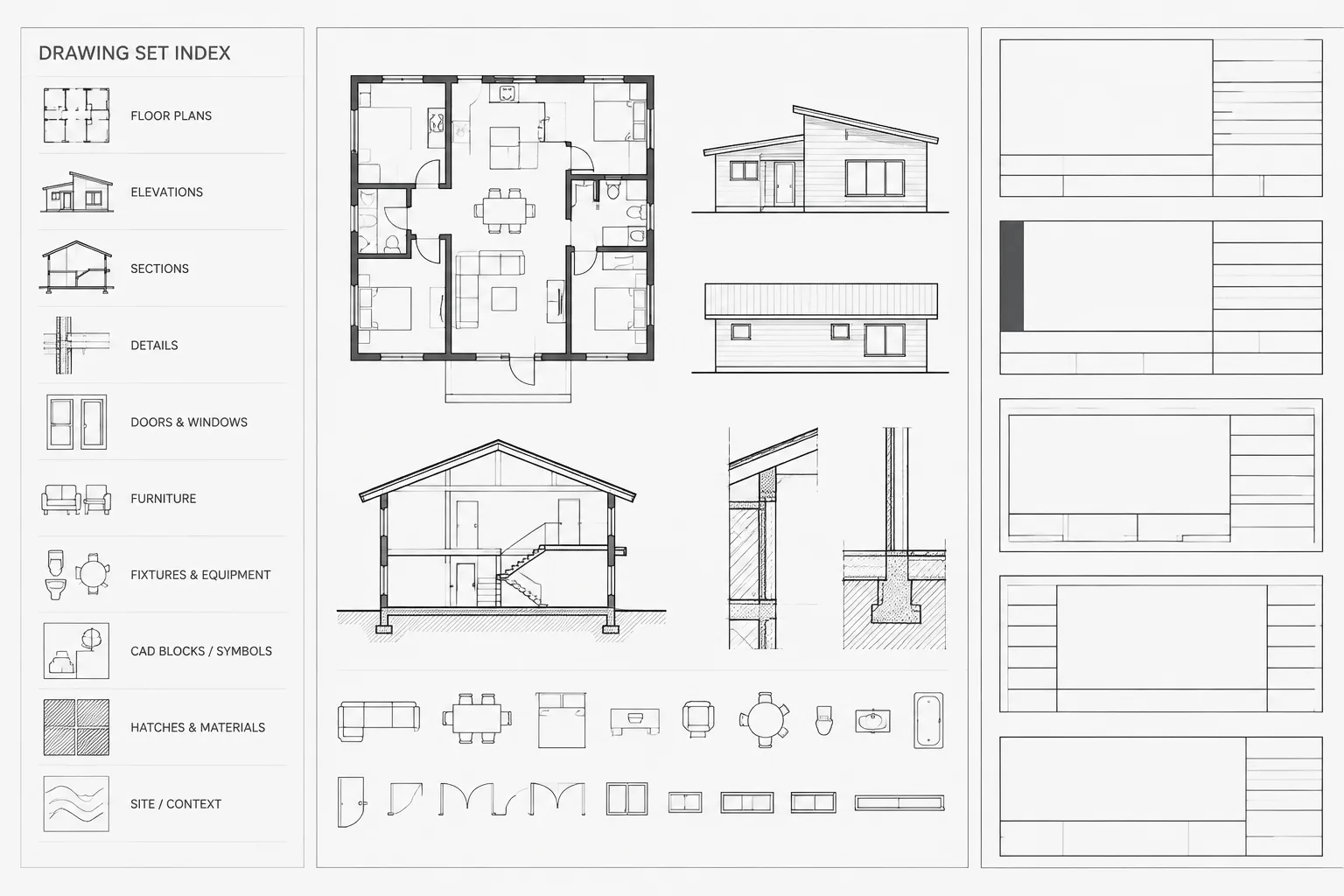
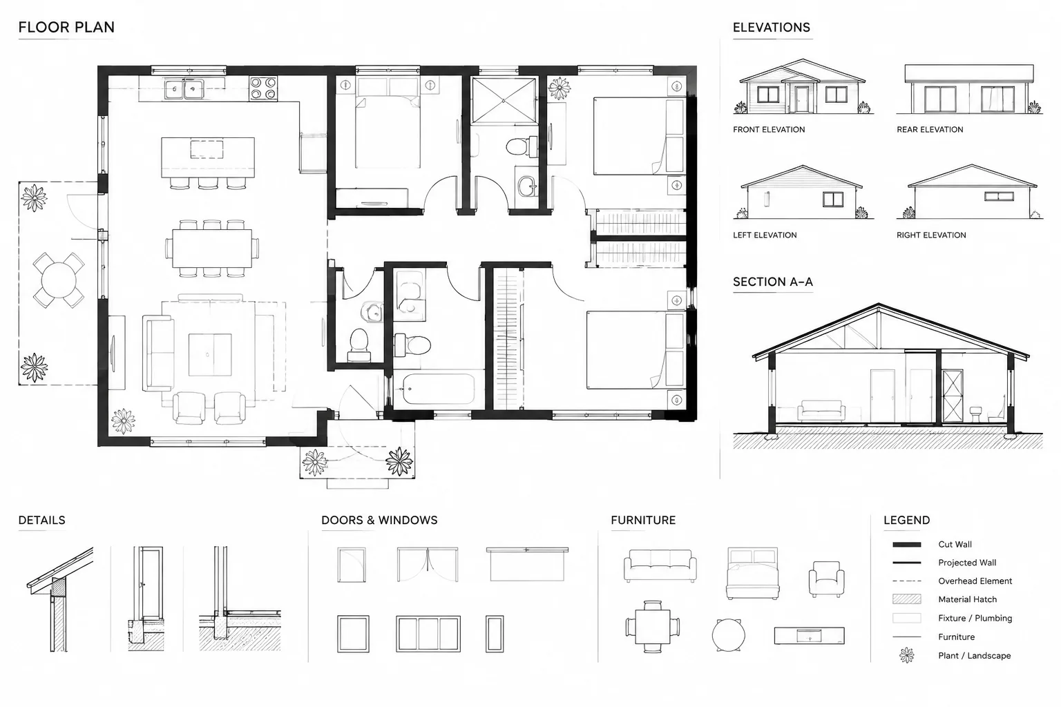
Lineweight is not merely a plotting preference; it is part of how an architectural plan explains the building. A successful hierarchy lets readers recognize cut construction, projected objects, overhead features, surface information, and annotation without studying every line individually.
This guide presents a practical workflow for developing, testing, and troubleshooting a floor plan lineweight hierarchy. It focuses on graphic roles and dependable CAD organization rather than prescribing universal plotted widths, since output behavior depends on the drawing purpose, office standards, sheet setup, and final reproduction method.
A readable architectural floor plan does more than show accurate geometry. It also communicates depth, importance, and spatial relationships through a controlled hierarchy of lineweights. Walls cut by the plan plane should not look the same as furniture beyond it, and overhead cabinets should not compete with doors, room tags, or section markers.
A dependable floor plan lineweight hierarchy begins with the meaning of each line, not with an arbitrary list of plotted widths. Exact output settings vary by office, drawing scale, printer, and project requirements. The practical goal is to create distinct graphic levels that remain clear when plotted, exported to PDF, and viewed at the intended sheet size.
What lineweight hierarchy communicates
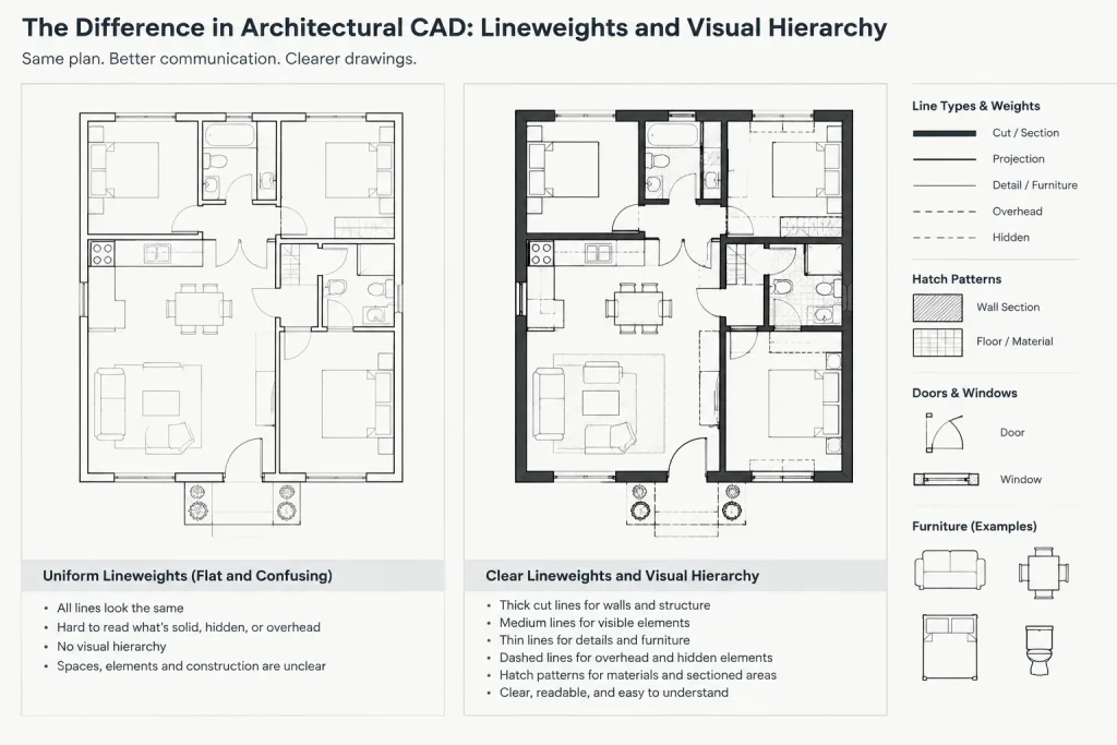
Lineweight hierarchy helps a reader understand which elements are being cut, which are seen beyond the cut plane, and which are included only as reference information. Without that hierarchy, a technically accurate plan can appear flat and difficult to interpret.
A typical floor plan needs to distinguish among several visual roles:
- Cut elements: Walls, columns, shafts, and other construction intersected by the plan cut plane.
- Strong profiles: Important boundaries or edges that define the primary shape of the building or a major opening.
- Projected elements: Doors, windows, fixtures, casework, stairs, and other objects visible below or beyond the cut plane.
- Overhead elements: Features above the cut plane, generally represented with a contrasting linetype or lighter graphic treatment.
- Surface information: Hatches, finish patterns, joints, and material indications.
- Annotation: Dimensions, text, tags, callouts, grids, and reference symbols.
The strongest lines should guide the eye toward the plan’s spatial structure. Secondary lines should provide useful information without obscuring that structure.
Build the hierarchy by graphic role
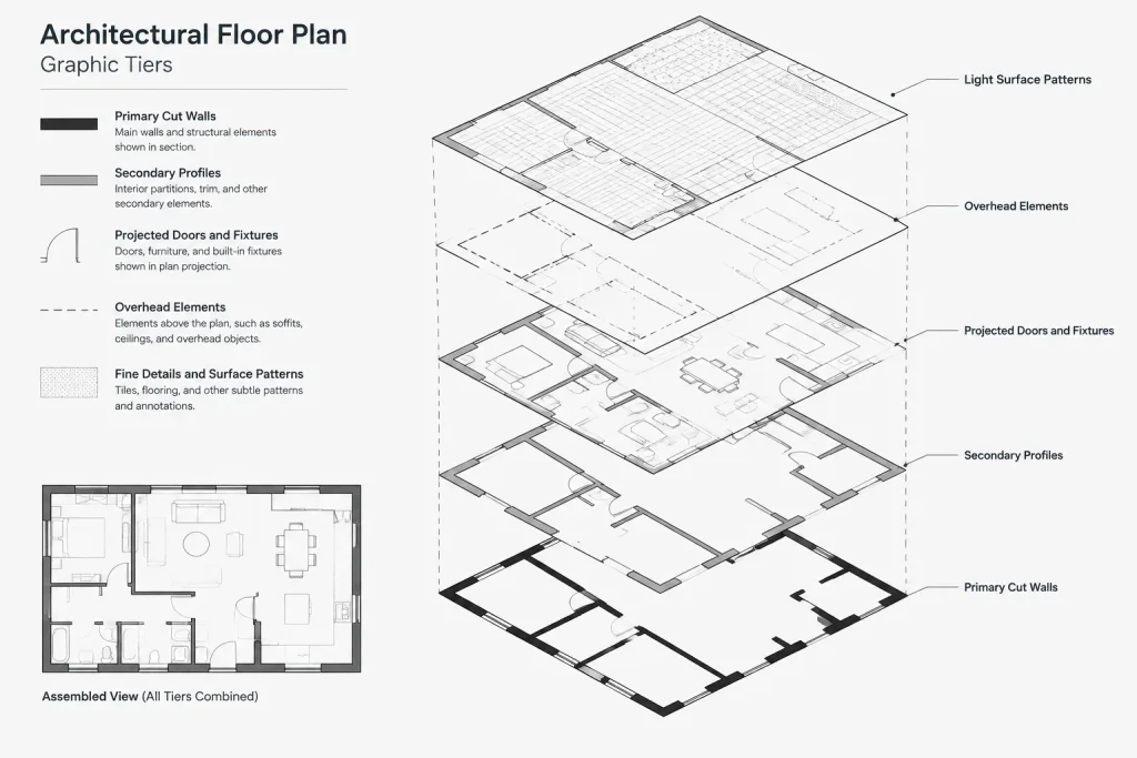
It is usually more reliable to organize lineweights into functional tiers than to assign a unique plotted weight to every object category. Too many nearly identical settings create complexity without producing a meaningful visual difference.
| Graphic tier | Common content | Intended reading |
|---|---|---|
| Primary cut | Cut walls, structural elements, major shafts | Defines the strongest spatial boundaries |
| Secondary profile | Opening edges, prominent outlines, selected changes in plane | Clarifies important forms without matching the cut graphics |
| Projection | Doors, glazing, fixtures, casework, stairs, equipment | Shows visible elements beyond the cut plane |
| Fine detail | Hardware indications, joints, minor components, detailed linework | Adds information without dominating the plan |
| Pattern or context | Hatches, existing context, background references | Supports interpretation while remaining visually subordinate |
These tiers are conceptual rather than mandatory settings. A small-scale overall plan may need fewer distinctions, while an enlarged plan may support additional detail. The hierarchy should respond to the final plotted scale and the purpose of the sheet.
Start with the plan cut
The cut plane establishes the logic of floor plan graphics. Determine which building elements the plan is intended to cut, then represent those elements consistently. A wall should not alternate between heavy and light graphics merely because different people drafted different portions of the file.
Wall poche can reinforce the cut condition, but poche should not be expected to solve an inconsistent outline. The perimeter of a cut element still needs a deliberate graphic treatment. Where poche is used, verify that dense fills do not close small openings, cover detail, or merge adjacent components when printed.
Columns and other structural elements require similar judgment. Their graphics should reflect whether they are cut, visible beyond, concealed, or shown only for coordination. The architectural plan should also be checked against the structural background so that duplicate outlines do not create unexpectedly heavy objects.
Separate projection lines from cut lines
Elements seen in projection generally need a lighter appearance than cut construction. This group may include door leaves and swings, window components, plumbing fixtures, appliances, furniture, millwork, and stair geometry.
Not every projected object deserves equal emphasis. Permanent architectural components may need to read more strongly than loose furniture or illustrative accessories. A chair block containing bold outlines, dense patterns, and excessive internal detail can overpower the room even when its insertion scale is correct.
Review imported and downloaded blocks before adding them to a production drawing. Check their layers, object colors, lineweights, linetypes, nested content, and draw order. Objects carrying fixed property overrides may ignore the intended layer-based hierarchy.
Give overhead elements a distinct visual language
Overhead cabinets, shelving, beams, upper-level edges, roof overhangs, and other features above the plan cut should be visibly different from elements at or below the cut plane. A suitable overhead linetype often provides that distinction, usually with a restrained lineweight.
Avoid using overhead graphics as a catch-all for uncertain geometry. Every overhead line should represent a specific element and should stop where that element ends. Long dashed lines crossing unrelated rooms can make the plan look like a coordination overlay rather than a finished architectural drawing.
Also verify linetype display in the actual sheet viewport. A pattern that looks clear in model space may appear continuous, fragmented, or too dense after viewport scaling and PDF output.
Keep hatches and surface patterns subordinate
Hatches can identify materials, cut construction, floor finishes, or areas of work, but they should not compete with boundaries and annotation. Dense patterns are especially likely to fill small spaces or create dark bands at intersections.
Use layers dedicated to hatch roles rather than placing every pattern on the same general-purpose layer. Separating cut poche, material indication, finish patterns, and existing-condition hatches makes plotting and viewport control more predictable.
Before reducing hatch density or changing plot properties, confirm that duplicate patterns are not stacked in the same location. Overlapping hatches can make an otherwise appropriate graphic setting print much darker than expected.
Coordinate annotation with the drawing graphics
Annotation needs enough contrast to remain readable, but it should not overpower the geometry it describes. Dimensions, room names, door tags, window tags, elevation markers, and section callouts have different purposes, yet they should feel like members of one coordinated annotation system.
Text and symbols should be tested at their plotted paper size. Judging them only while zoomed into model space can be misleading. Background masks may improve readability over dense geometry, but oversized masks can erase wall lines, hatches, or adjacent notes. Use them selectively and inspect their effect in the PDF.
Callout symbols often need more visual presence than ordinary dimensions because they direct the reader to another view or sheet. That emphasis should come from a controlled symbol design rather than an excessively heavy collection of lines.
Use layers and object properties consistently
A layer-based workflow makes lineweight behavior easier to manage. Assign each layer a defined graphic role, then keep most objects set to inherit their properties from the layer. This allows global adjustments without editing objects individually.
Object-level overrides are sometimes useful, but they should be exceptions. Frequent overrides make troubleshooting difficult because two objects on the same layer may plot differently. Nested block objects can add another level of uncertainty if they use fixed properties rather than inheritable settings.
When diagnosing an inconsistent line, inspect the complete property chain:
- The object’s layer and direct property overrides
- Properties of objects nested inside a block
- Layer properties and viewport-specific overrides
- The active plot style system and page setup
- Whether lineweight display and lineweight plotting are enabled as intended
- The PDF viewer and printer used for the final check
Test at the intended output scale
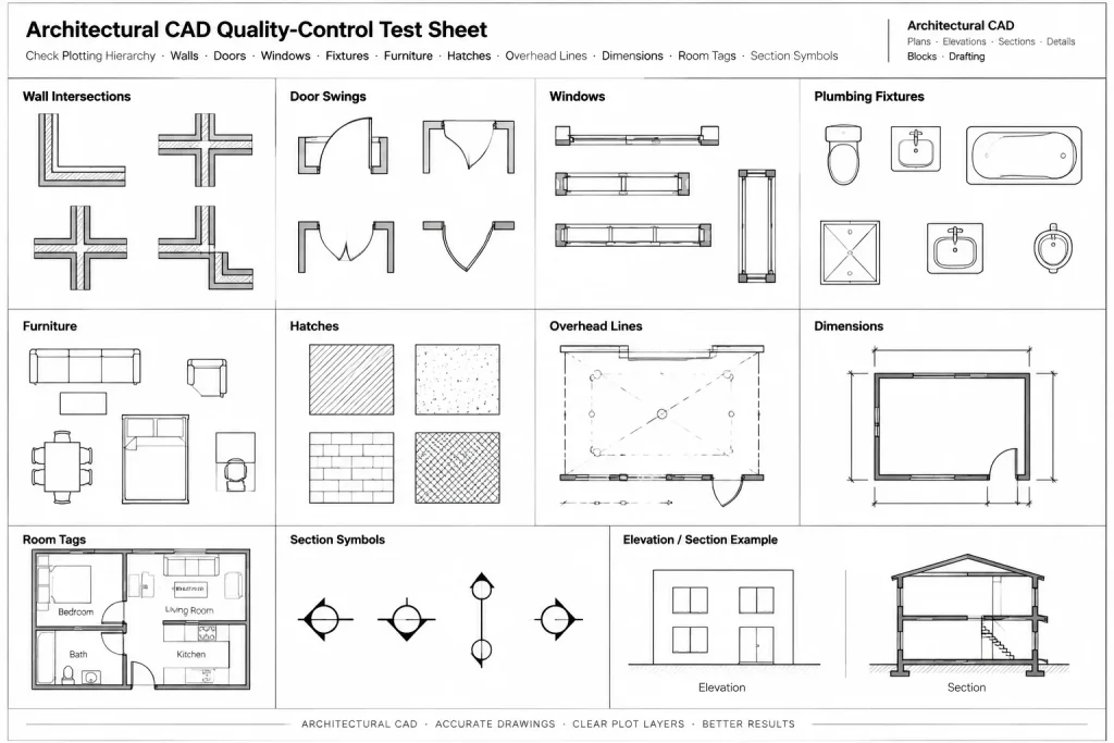
Lineweight decisions should be made from plotted samples, not from the model-space display alone. Prepare a representative test area containing exterior and interior walls, openings, furniture, fixtures, hatches, dimensions, tags, and overhead lines. Plot or export it using the same page setup and viewport scale planned for the sheet.
Review both the PDF and a physical print when printed output is part of the deliverable. Look for distinctions that disappear, lines that merge, hatches that become solid, and annotation that loses contrast. If a hierarchy works only at high zoom, it is not yet dependable.
A practical quality-control sequence
- Confirm the cut logic. Check that cut, projected, and overhead elements are classified consistently.
- Review layers. Look for geometry placed on generic or incorrect layers.
- Find overrides. Inspect objects and blocks that do not follow layer properties.
- Check duplicate linework. Stacked objects may plot darker than intended.
- Inspect viewport controls. Confirm that layer overrides are intentional and limited to the relevant view.
- Plot a representative sample. Evaluate the hierarchy at the final sheet scale.
- Compare related plans. Enlarged plans, reflected ceiling plans, finish plans, and consultant backgrounds should not introduce contradictory graphic meanings.
Make the hierarchy part of the template
Once a successful graphic hierarchy has been tested, incorporate it into the office CAD template. Coordinate layers, plot styles, page setups, annotation styles, and approved blocks so that new drawings begin with predictable behavior.
The template should support judgment rather than replace it. Different views may require different emphasis, and a renovation plan may need existing, removed, and new work to remain distinct. Project-specific requirements should always be verified before relying on a standard setup.
A strong floor plan lineweight hierarchy is ultimately a reading system. When cut elements establish the space, projected objects provide context, overhead features remain distinct, and annotation is easy to follow, the drawing communicates quickly without sacrificing technical content.
Use reading order to evaluate the finished plan
After the technical settings are in place, review the plan as a communication document. The primary spatial boundaries should register first, followed by openings and permanent projected elements. Furniture, patterns, minor details, and background information should become apparent without competing with the building geometry.
This reading-order test can reveal problems that are difficult to identify by inspecting layer settings alone. A drawing may be technically organized yet still feel visually flat because several graphic roles produce nearly identical output.
Troubleshoot the visible symptom before changing the standard
When a plan does not plot clearly, avoid making broad changes immediately. Identify the affected graphic role, isolate a representative object, and follow its properties through the drawing and plotting setup.
- Cut boundaries appear weak: Confirm that the geometry is classified as cut, placed on the intended layer, and not obscured by fills or duplicate background lines.
- Furniture appears too dominant: Inspect the block for fixed colors, direct lineweight assignments, dense internal details, and nested objects that do not inherit layer properties.
- Hatches appear unexpectedly dark: Check for overlapping patterns, unsuitable pattern behavior at the viewport scale, and plot settings that reduce the distinction between hatch and boundary lines.
- Overhead lines appear continuous: Review the assigned linetype, viewport display, object scale behavior, and final PDF rather than relying only on model-space appearance.
- Annotation disappears into the plan: Examine its contrast against nearby geometry and patterns before increasing the strength of the entire annotation system.
Check hierarchy at congested locations
Openings, wall intersections, stairs, fixture groups, and areas containing multiple references are useful quality-control locations. These conditions show whether cut lines, projected geometry, hatches, symbols, and text can coexist without merging into an unreadable patch.
Also inspect transitions between the architectural drawing and referenced consultant information. Duplicate geometry or incompatible graphic conventions can create false emphasis even when each file looks acceptable on its own.
Document intent, not just settings
A maintainable CAD standard should describe what each graphic tier means. Naming a layer or plot property without defining its visual role leaves future users to guess whether it represents cut construction, projection, context, or annotation.
Brief descriptions of layer purpose, approved block behavior, plotting expectations, and common exceptions can make the hierarchy easier to apply consistently. Any project-specific graphic conventions should remain coordinated with the responsible design team and the required deliverables.
Frequently asked questions
Why do different CAD lineweights look the same in the PDF?
The plotted distinctions may be too subtle for the selected output conditions, or the objects may be receiving the same effective plot treatment. Check layer properties, direct overrides, nested block properties, viewport overrides, page setup, plot style behavior, and duplicate geometry. Evaluate the PDF at its intended sheet size.
Should furniture use the same lineweight as walls?
Furniture is generally projected or contextual information rather than cut construction, so it should not compete with the primary wall hierarchy. The appropriate treatment depends on the furniture’s purpose in the plan and the amount of internal detail in the block.
Is it better to control lineweights by layer or by object?
Layer-based control is usually easier to coordinate and revise because related objects inherit a common graphic role. Object-level overrides can handle genuine exceptions, but extensive overrides make inconsistencies and plotting problems harder to diagnose.
Why does a block plot darker than other objects on the same layer?
The block may contain nested objects with fixed colors, assigned lineweights, unexpected layers, dense linework, fills, or overlapping geometry. Inspect the block definition rather than checking only the properties of the inserted block reference.
Can model-space appearance be used to approve a lineweight hierarchy?
Model-space display is useful for drafting but does not replace output testing. Viewport settings, plot styles, page setup, PDF processing, and printing can change how the hierarchy reads. Approval should be based on representative output at the intended sheet presentation.
How should existing, removed, and new work affect lineweight hierarchy?
These conditions need distinct and coordinated graphic meanings, but the exact conventions depend on the project documentation standard. Each condition should remain legible while still preserving the broader distinction between cut, projected, overhead, patterned, and annotated information.