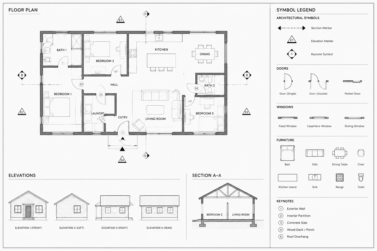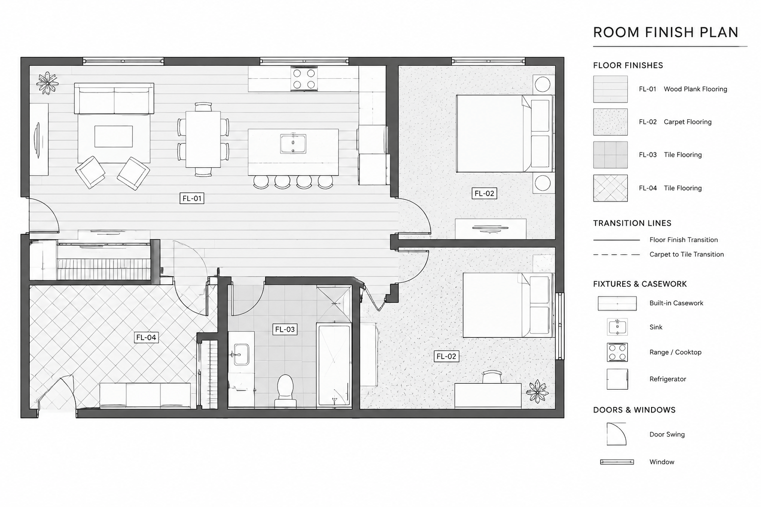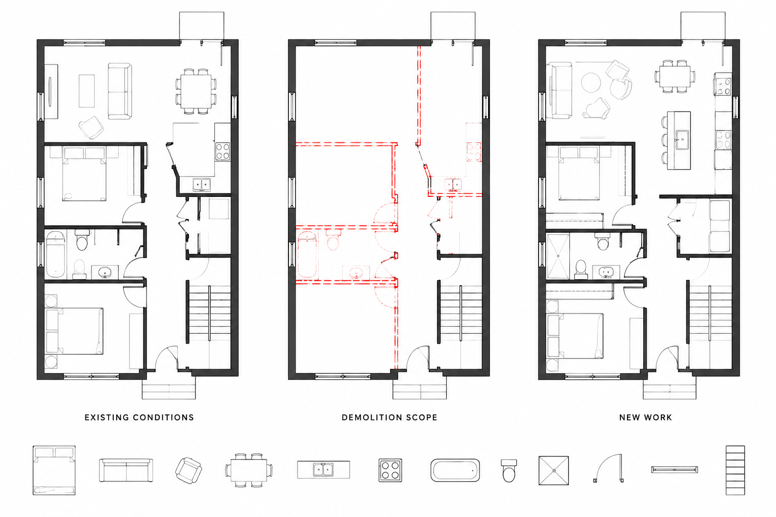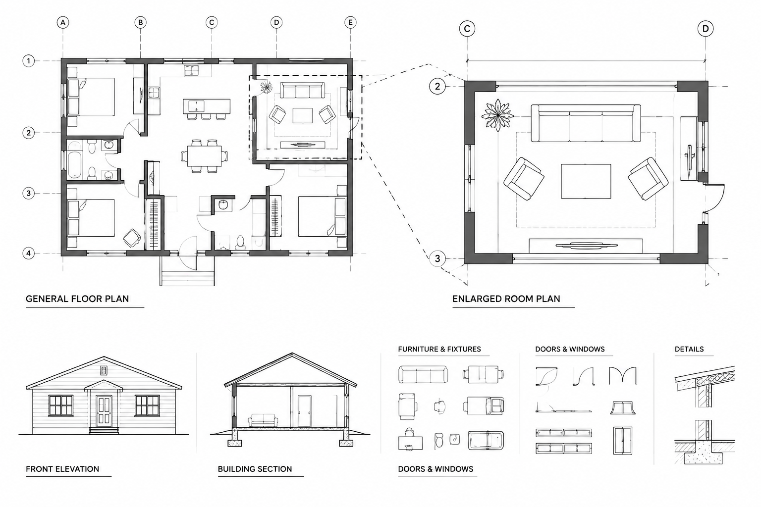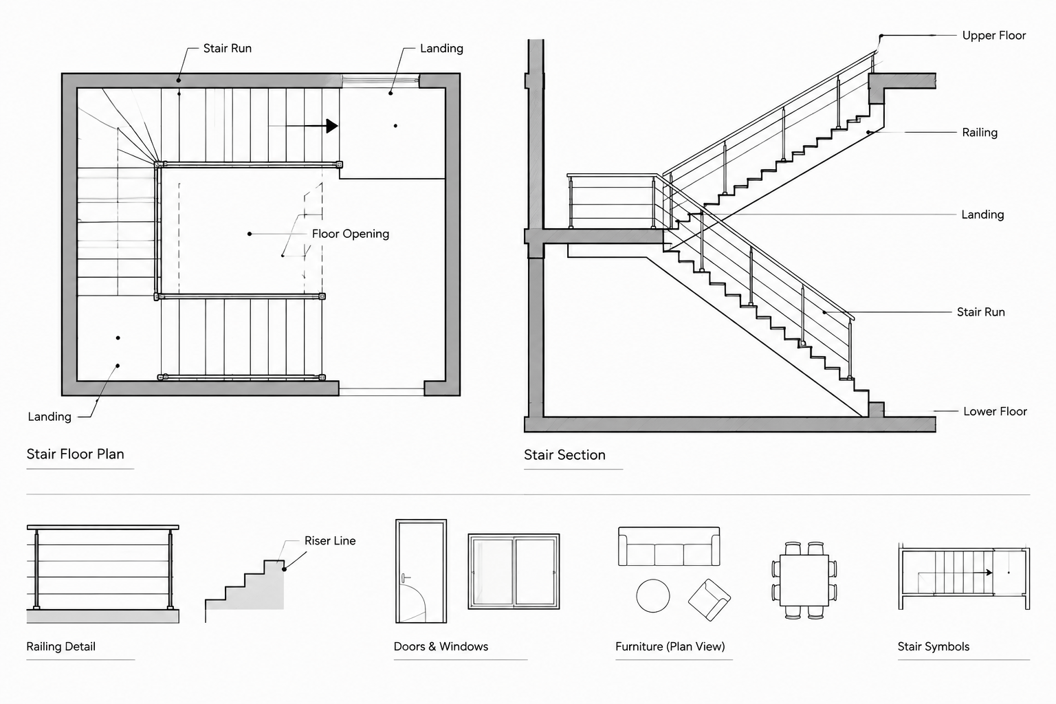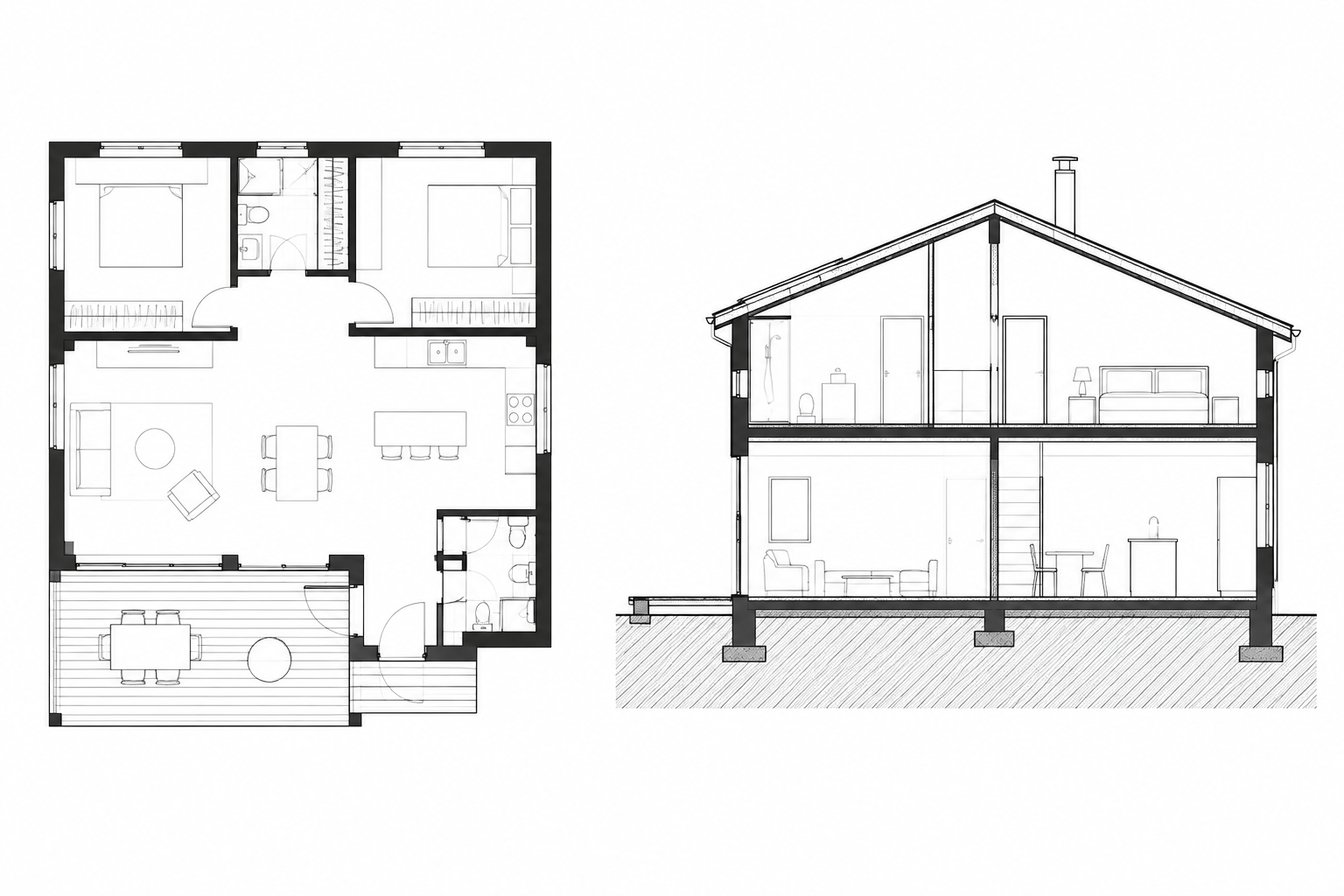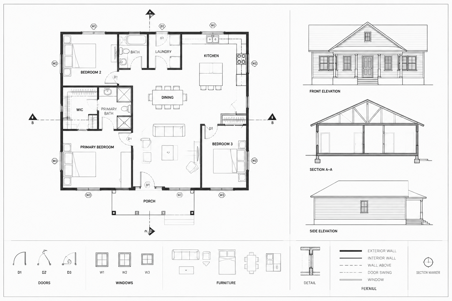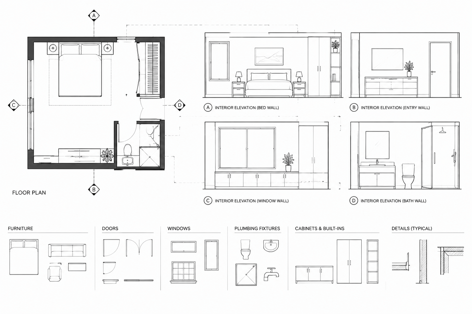
Architectural CAD lineweights do more than make a drawing look polished. They establish a visual hierarchy that helps readers distinguish cut elements, visible edges, background information, surface patterns, and annotation. When that hierarchy is missing, a technically complete drawing can still be difficult to interpret.
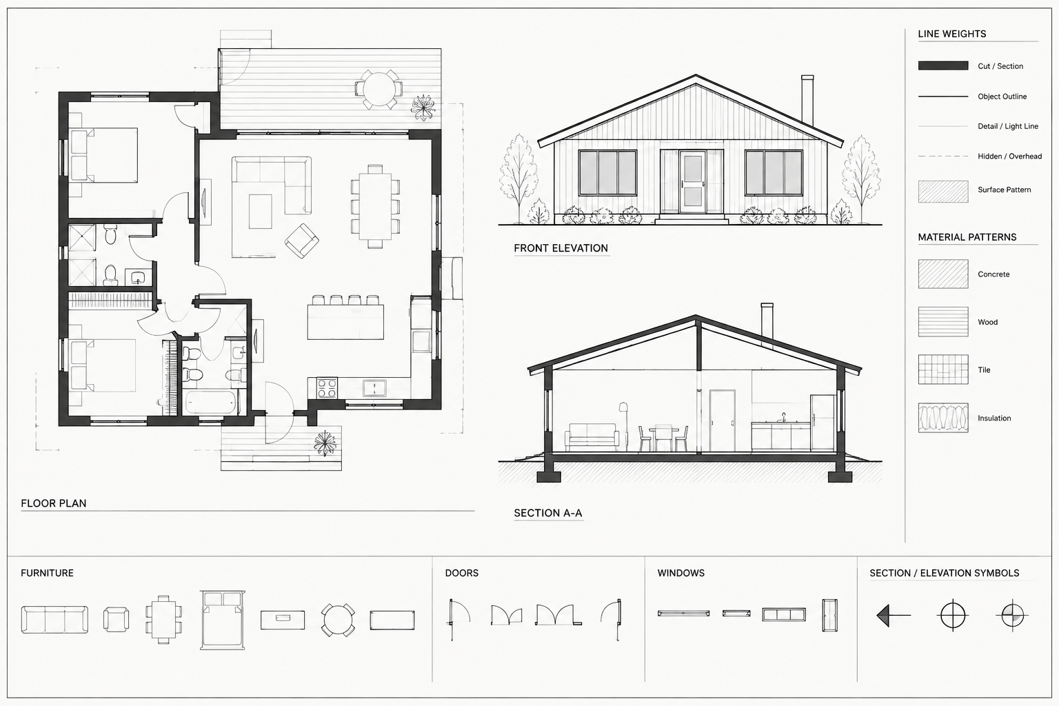
A good lineweight system should remain understandable across plans, elevations, sections, and details. It also needs to work through the complete drawing process: object properties, layers, plot styles, page setups, PDF output, and physical printing. The goal is not to assign a unique thickness to every object. It is to create a small, predictable family of graphic roles.
Think in graphic roles, not individual objects
Before editing layer colors or plot settings, decide what each line needs to communicate. A wall cut in plan has a different role from a countertop edge, even if both objects are important. Likewise, a stair beyond the cut plane should not compete with the stair elements being cut.
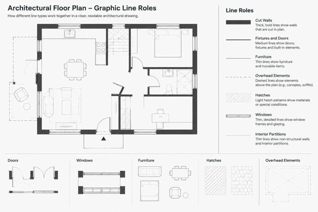
A practical hierarchy can be organized into the following roles:
| Graphic role | Typical content | Intended appearance |
|---|---|---|
| Primary cut | Walls, columns, floors, roofs, and other elements intersected by a section or plan cut | Strongest emphasis |
| Primary profile | Building silhouettes, major boundaries, and dominant foreground edges | Heavy but subordinate to cut elements |
| Visible object | Doors, windows, fixtures, casework, equipment, and surface edges | Clear medium emphasis |
| Secondary detail | Joints, trim, panel divisions, hardware, and minor components | Light emphasis |
| Surface information | Hatches, material patterns, tile grids, and texture indications | Light and visually quiet |
| Beyond or overhead | Objects above, below, hidden, or beyond the primary viewing plane | Light, dashed, or otherwise differentiated |
| Annotation | Dimensions, leaders, notes, tags, grids, and reference symbols | Consistent and readable without overpowering geometry |
This role-based approach makes the system easier to maintain. If the drawing appears too dark, the surface and secondary roles can be adjusted together instead of editing many unrelated objects.
Coordinate layers, object properties, and plot styles
Lineweight problems often begin when a file uses several control methods at once. Some objects may have explicit lineweights, others may inherit properties from layers, and still others may depend on a plot style. The result can be difficult to predict.
For most architectural production files, assigning properties by layer creates a more manageable foundation. Objects placed on a wall layer inherit the intended wall appearance, while dimensions inherit the established annotation settings. Exceptions can still be made, but they should be deliberate and limited.
Understand the plot-style method in the file
CAD drawings may use color-dependent plot styles or named plot styles. A color-dependent system maps drawing colors to plotted properties. A named system assigns descriptive plot styles to layers or objects. Both can produce clear architectural sheets, but the office template, consultant files, and page setups must follow the same logic.
Do not assume that an imported layer color will plot correctly simply because it looks familiar on screen. Review the active plot-style method, confirm the assigned plot-style file, and inspect the output through a plot preview or test PDF.
Avoid unnecessary object-level overrides
Explicit lineweight, color, and plot-style overrides can be useful for isolated conditions, but widespread overrides make global revisions harder. If changing a layer does not update all expected objects, inspect those objects for manually assigned properties and nested block content.
Apply lineweight hierarchy by drawing type
Floor plans
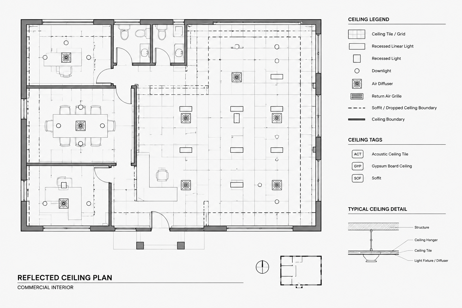
In a floor plan, elements intersected by the plan cut should normally provide the strongest visual structure. Visible items below the cut plane, such as fixtures, cabinetry, floor transitions, and furniture, should be lighter. Elements above the cut plane can use a distinct overhead convention so they are not mistaken for cut or visible objects.
Door panels and swings need enough contrast to communicate operation, but they should not become heavier than the surrounding wall cut. Dense furniture blocks, appliance symbols, and plumbing fixtures may need cleanup if their internal detail forms dark patches at the sheet scale.
Elevations
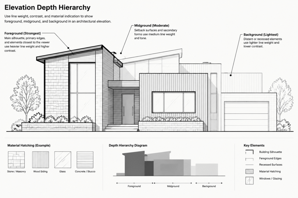
Elevations rely on depth rather than a plan cut. The outer building profile and major foreground edges usually receive more emphasis, while recessed surfaces and distant elements are lighter. Material hatches should support the facade composition without obscuring openings, joints, or annotation.
A common mistake is giving every visible edge the same weight. This flattens the elevation and makes projections difficult to understand. Use a clear foreground, middle-ground, and background relationship, then check that the hierarchy still reads when printed.
Building sections
Sections typically need the clearest contrast between cut and uncut construction. Cut walls, slabs, roofs, and structural elements establish the section profile. Objects viewed beyond the cut should be progressively quieter so they provide context without competing with the sectioned assembly.
Material poche can strengthen the cut, but overly dense patterns may merge with boundary lines. Keep the cut outline legible and evaluate poche at the intended output scale rather than relying only on a close screen view.
Enlarged plans and details
Larger-scale drawings can show joints, membranes, fasteners, trim, and layered assemblies that would be inappropriate in a general plan. Even so, additional detail should not mean additional visual noise. Preserve a hierarchy between the main assembly profile, component edges, fine material indications, and explanatory annotation.
Keep hatches and CAD blocks under control
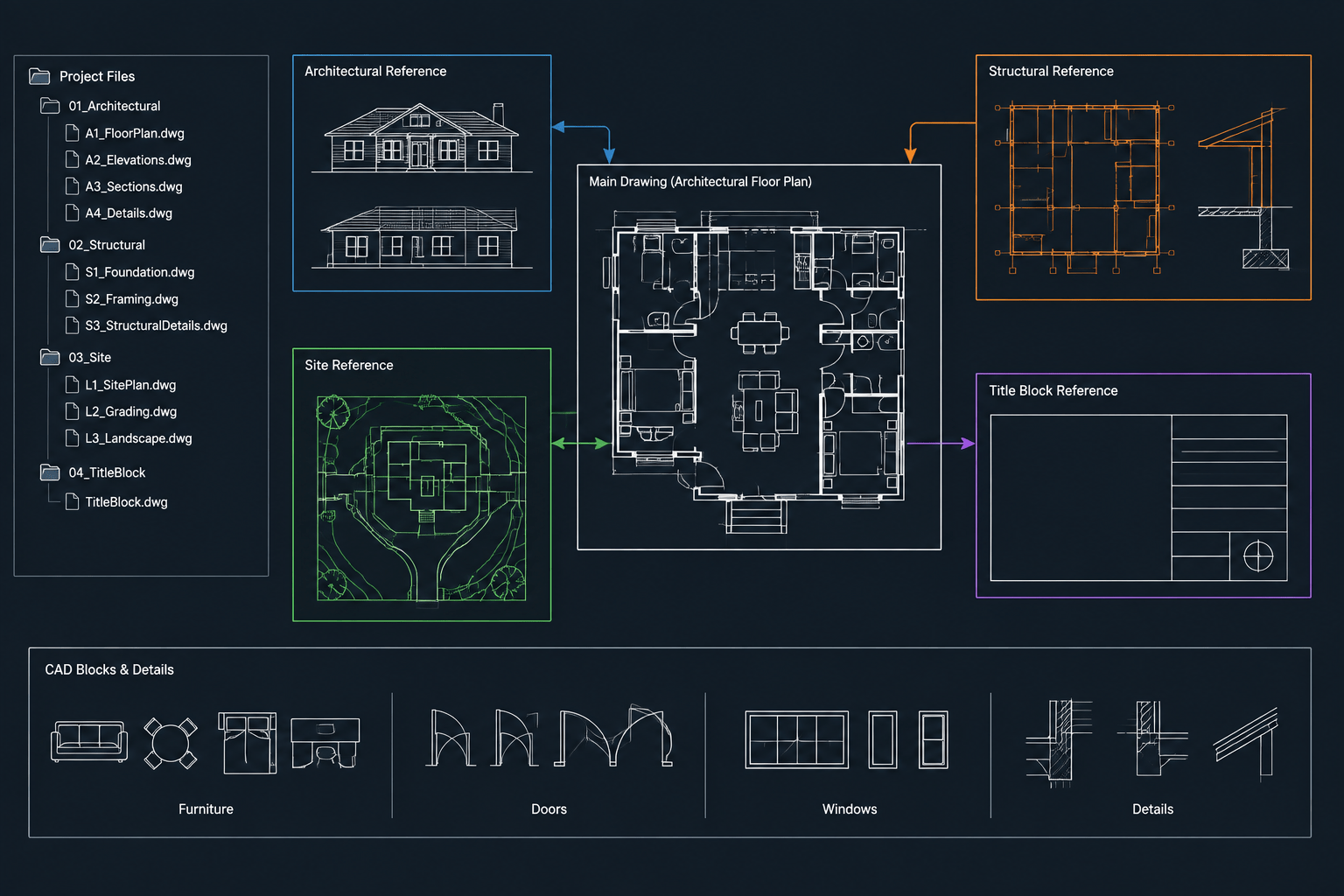
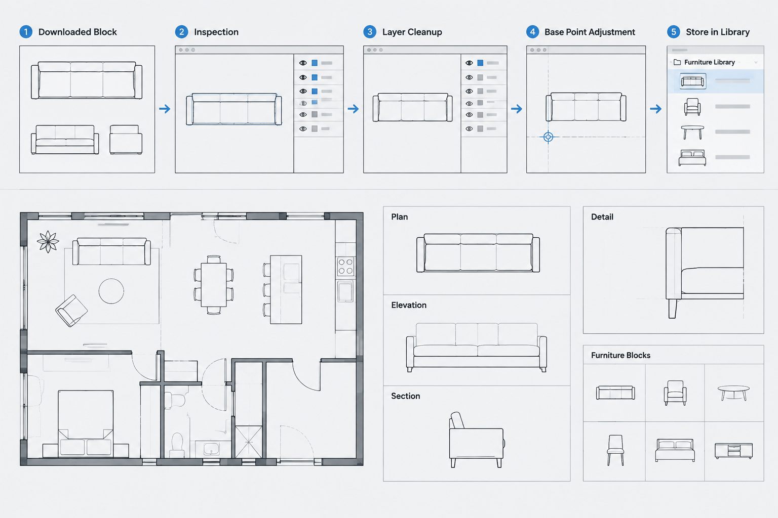
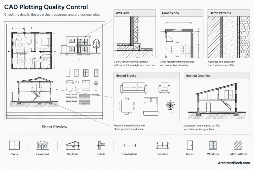
Downloaded blocks frequently contain their own colors, layers, lineweights, and dense internal geometry. A block that looks acceptable in isolation may become too dark when repeated across a plan. Inspect block definitions before relying on the host layer to control appearance.
- Check whether nested objects use layer-based properties or fixed overrides.
- Remove decorative detail that does not contribute at the intended drawing scale.
- Separate major outlines from minor internal lines when practical.
- Review solid fills and dense hatches for unintended dark areas.
- Test repeated blocks, not just a single instance.
Hatches should generally sit behind boundaries and annotation in the graphic hierarchy. If a material pattern is the first thing noticed on a sheet, it is probably too dominant.
Evaluate annotation separately from model geometry
Dimensions, notes, leaders, room names, tags, grids, and reference symbols form their own communication system. They must be readable, but making all annotation heavy can overwhelm the drawing.
Differentiate annotation by function rather than by arbitrary object choice. Major reference markers may need more emphasis than dimension extension lines or secondary notes. Text, arrows, symbols, and linework should appear coordinated when viewed on the completed sheet.
Also inspect annotation near heavy geometry. A dimension line that crosses a strong wall profile may become difficult to follow. Adjust placement, spacing, masking, or local drawing composition instead of automatically increasing the annotation weight.
Test output at the intended sheet scale
Lineweights cannot be judged reliably from model-space zoom alone. Screen display is affected by zoom level, display settings, monitor resolution, and background color. The printed or exported sheet is the meaningful test.
Use this review sequence:
- Confirm the viewport scale and page setup.
- Verify that the correct plot-style file is assigned.
- Confirm that lineweight plotting is enabled where required.
- Generate a preview and then a PDF using the project workflow.
- Review the complete sheet at normal viewing size.
- Zoom in to check joins, hatch density, symbols, and small details.
- Print a representative sheet when physical output is part of the deliverable.
A test area containing cut walls, openings, furniture, dimensions, hatches, and reference symbols can help diagnose the system before an entire drawing package is plotted.
Common lineweight failures and practical fixes
The entire sheet looks too dark
Look for dense hatches, detailed blocks, heavy visible-object layers, and annotation that is competing with the building geometry. Reduce secondary information as a group rather than weakening the primary cut hierarchy.
Everything plots at nearly the same weight
Confirm that the expected plot style is active and that objects are using the intended layer, color, or named style. Also check for a page setup that is not plotting object lineweights.
Changes to a layer do not affect some objects
Inspect object-level overrides and nested block entities. Content inside an external reference or block definition may follow properties that are not controlled by the current host layer.
The PDF looks correct, but the office print does not
Printer drivers, scaling options, paper selection, and device settings can affect output. Compare the same PDF on another device and verify that no fit-to-page or output-processing option is changing the drawing.
A repeatable quality-control checklist
- Can cut, profile, visible, secondary, and surface lines be distinguished immediately?
- Do plans, elevations, sections, and details use related graphic logic?
- Are background elements visibly subordinate?
- Are hatches lighter than the boundaries they describe?
- Do repeated blocks remain clear instead of forming dark clusters?
- Is annotation readable without dominating the drawing?
- Are object-level overrides limited and intentional?
- Has the sheet been reviewed through the actual PDF and print workflow?
A successful architectural lineweight system is simple enough to apply consistently and flexible enough to describe different drawing types. Build the hierarchy around graphic meaning, control it through coordinated layers and plot styles, and judge it at the final sheet scale. The result is not merely a cleaner CAD file—it is a drawing that communicates construction and spatial relationships more quickly.