Hatches and poché help architectural drawings communicate surfaces, materials, and the relationship between cut and uncut elements. Used carefully, they make plans, elevations, sections, and details easier to read. Used without a hierarchy, they can obscure dimensions, compete with annotations, and produce drawings that are difficult to plot.
The goal is not to fill every visible object with a pattern. The goal is to apply graphical information only where it improves interpretation. A successful architectural CAD drawing remains understandable at its intended sheet scale, in grayscale, and after printing or PDF export.
Hatch, poché, and material pattern are not the same thing
These terms are related, but each performs a different graphical job:
- Hatch is the general CAD term for a repeated pattern, solid fill, or gradient placed inside a boundary.
- Poché is a graphic treatment that emphasizes material or construction cut by the drawing plane. It is commonly shown as a dark or solid fill, although office conventions vary.
- Material pattern represents or suggests a surface or assembly, such as masonry, concrete, earth, insulation, tile, or wood.
- Screen or tone is a lighter fill used to separate zones, existing work, overhead information, or other secondary content.
A solid fill can therefore function as poché in one drawing and as a diagrammatic tone in another. Its meaning comes from the drawing context, layer assignment, plot treatment, and legend—not simply from the hatch name.
Begin with the drawing’s cut-plane logic
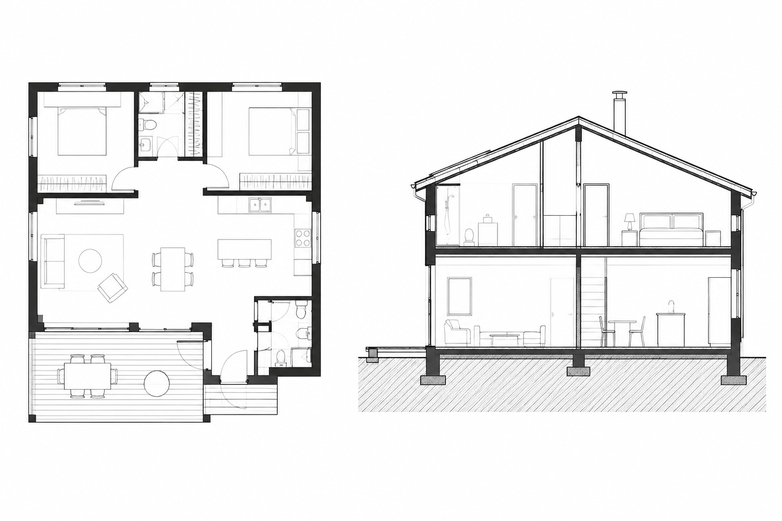
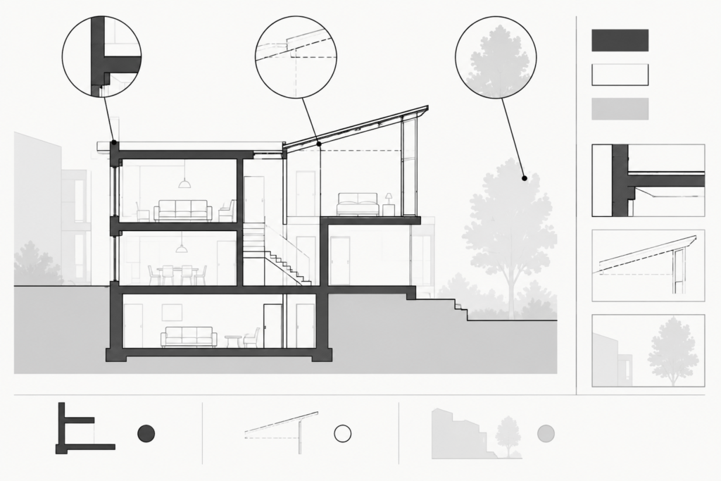
Before adding patterns, determine what the view actually cuts. In a floor plan, the primary cut usually passes through walls and selected building elements. In a building section, it passes through floors, roofs, walls, foundations, and other assemblies. Elements beyond the cut plane are seen in projection and should normally have less graphic emphasis.
This distinction establishes a useful hierarchy:
- Cut elements: strongest outlines and, where appropriate, poché or material fill.
- Projected elements: lighter outlines with limited surface patterning.
- Background information: reduced lineweight or screened graphics.
- Annotations: clear and unobstructed by dense patterns.
Do not use a dark hatch to compensate for an unclear cut boundary. Correct the wall, slab, roof, or component geometry first. Poché should reinforce an accurate drawing rather than conceal unresolved intersections.
Choose hatch types according to purpose
| Graphic treatment | Typical purpose | Common risk |
|---|---|---|
| Solid or dark poché | Emphasizing elements cut in plan or section | Closing small openings or overwhelming nearby notes |
| Material pattern | Identifying a material or surface where that information matters | Implying unnecessary construction detail |
| Light screen | Separating zones or secondary information | Disappearing during plotting or reproduction |
| Directional pattern | Indicating orientation, coursing, grain, or modular layout | Conflicting with dimensions and object lines |
| Earth or landscape pattern | Clarifying grade, soil, paving, or planted areas | Creating visually noisy site plans |
Material hatches should not be treated as decoration. Add them when the reader needs to identify a material, understand an assembly, follow a change in finish, or distinguish adjacent surfaces. A general arrangement plan may need very little material information, while a wall section or enlarged detail may require more.
Organize hatches on dedicated CAD layers
Separating hatch graphics from object outlines provides better control over visibility and plotting. A practical layer structure may distinguish cut poché, material patterns, surface finishes, site patterns, and diagrammatic tones. The exact layer names should follow the project or office CAD convention.
A dedicated layer strategy allows a drafter to:
- Adjust hatch lineweight or screening without changing boundary objects.
- Freeze patterns in views where they are unnecessary.
- Differentiate existing, new, and removed work when the project requires it.
- Control material information independently at different drawing scales.
- Troubleshoot crowded sheets more efficiently.
Avoid placing every hatch on one generic layer. A single layer may be convenient at first, but it becomes difficult to manage when plans, sections, elevations, and details need different graphic treatments.
Build reliable hatch boundaries
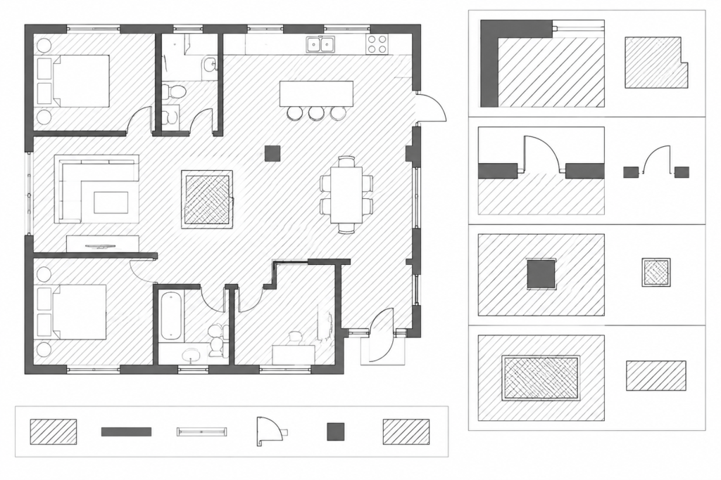
The quality of a hatch depends on the quality of its boundary. Small gaps, overlapping lines, duplicated geometry, and distant stray objects can cause failed fills or unexpected islands. Before using the HATCH command, inspect the area and simplify the enclosing geometry.
Use closed boundaries where practical
Closed polylines provide predictable limits and can be easier to edit than boundaries assembled from many independent line segments. They are especially helpful for floor finishes, ceiling zones, paving areas, and diagrammatic fills.
Keep boundary geometry separate when needed
A hatch does not always need to share its visible outline with the architectural object. A separate closed boundary can give the drafter more control, particularly around complex wall intersections or irregular site areas. Place construction boundaries on an appropriate non-plotting layer if they are not intended to appear on the sheet.
Review island behavior
Openings, fixtures, columns, shafts, and nested rooms may be detected as islands inside a hatch boundary. Confirm whether each island should remain blank or receive the fill. Automatic detection is useful, but it does not replace visual review.
Set scale by testing the plotted view
A hatch can look appropriate in model space but become too dense, too sparse, or visually broken on the final sheet. Evaluate patterns through the actual layout viewport and plot configuration rather than relying only on a close model-space view.
The pattern should be recognizable without becoming the dominant graphic. If individual hatch lines merge into a dark mass, reduce the density or choose a simpler treatment. If the pattern is so open that its meaning becomes unclear, revise it for the intended output scale.
Details and overall plans do not necessarily need the same pattern density. The same material may require different graphic treatment at different view scales. Consistency of meaning is more important than forcing one visual setting into every drawing.
Use hatches differently in plans, elevations, and sections
Floor plans
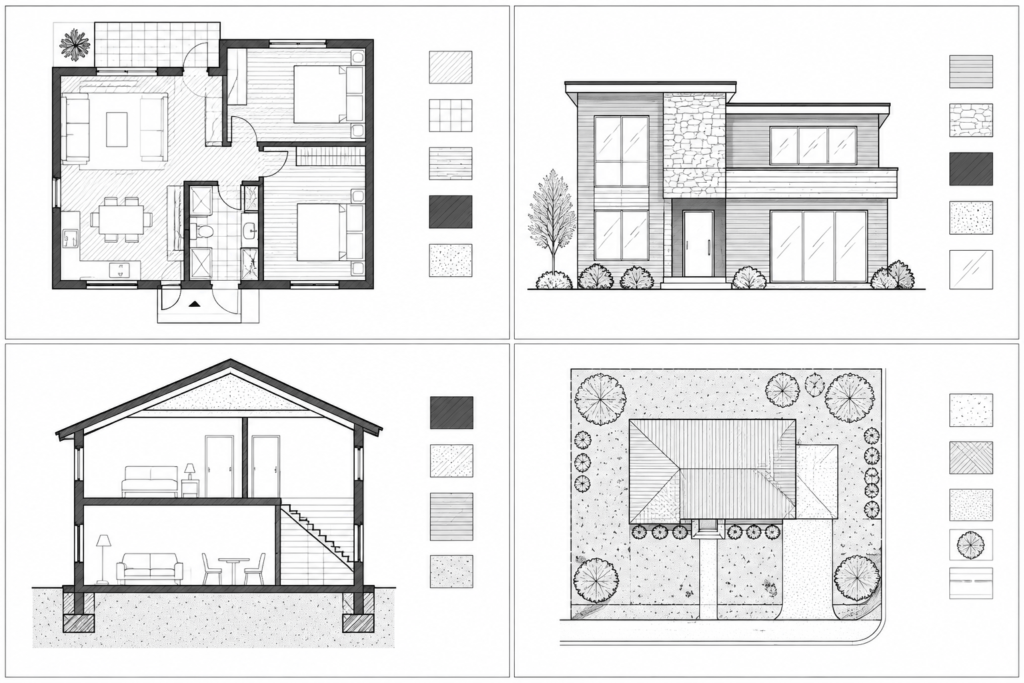
Prioritize cut walls, columns, and other elements intersected by the plan cut. Floor finish patterns should be restrained and are often most useful in enlarged plans or finish drawings. Large fields of tile, wood, or carpet pattern can reduce legibility if they run beneath furniture, dimensions, room names, and symbols.
Elevations
Use surface hatches to explain meaningful changes in cladding, coursing, panelization, or finish. Patterns should support the elevation’s depth hierarchy. Recessed surfaces, foreground edges, openings, and background objects still need differentiation through lineweight and line type.
Sections
Sections usually benefit most from clear poché because cut construction must be distinguished from projected objects beyond. Material patterns can clarify assemblies, but avoid filling every layer if the resulting density makes the section harder to read. Enlarged details can carry information that would be excessive in a building section.
Site drawings
Landscape, paving, water, and ground patterns can cover large areas. Keep them light enough that property information, grading graphics, utilities, building outlines, and notes remain legible. Dense site hatches can also increase file complexity, so use bounded areas rather than unrestricted fills.
Protect dimensions and annotations
Text and dimensions should remain readable without requiring the viewer to interpret them through a pattern. Where a hatch conflicts with annotation, consider simplifying the pattern, adjusting the layout, or using a controlled background mask according to the project’s drafting practice.
Do not rely on draw order alone as the only solution. Draw order can improve presentation, but a drawing filled with competing graphics is still difficult to manage. A cleaner hatch strategy reduces the need for repeated manual corrections.
Check performance and file cleanliness
Complex patterns, excessive boundary segments, and large associative hatch areas can make a DWG slower to navigate and edit. Keep hatch geometry proportionate to the information being communicated. Avoid exploding hatches simply to change their appearance; exploded patterns create many separate objects and are harder to revise.
When importing or cleaning a downloaded DWG, inspect hatches for unknown patterns, unusual origins, very dense spacing, incorrect layers, and boundaries located far from the main drawing. Replace problematic patterns with approved project graphics rather than carrying unnecessary complexity into the working file.
A practical hatch review checklist
- Confirm that the drawing correctly distinguishes cut, projected, and background elements.
- Use poché only where it strengthens the cut-plane reading.
- Apply material patterns where they communicate necessary information.
- Place hatches on logical layers separate from primary object outlines.
- Check closed boundaries, openings, and island behavior.
- Review pattern density in the intended paper-space viewport.
- Test the sheet in grayscale and at final output size.
- Ensure dimensions, symbols, and notes remain unobstructed.
- Remove duplicate, exploded, or excessively complex hatch geometry.
- Verify graphic conventions against the project requirements before issue.
Use graphic restraint as a drafting tool
Effective architectural CAD hatches and poché establish hierarchy rather than simply adding texture. Start with accurate geometry and a clear understanding of the cut plane. Then use fills and patterns selectively to explain materials, surfaces, and spatial relationships.
A drawing with fewer, well-controlled hatches is often more useful than one that attempts to represent every visible material. Plot testing, layer organization, and disciplined boundaries will produce cleaner DWG files and sheets that remain legible throughout design coordination and documentation.