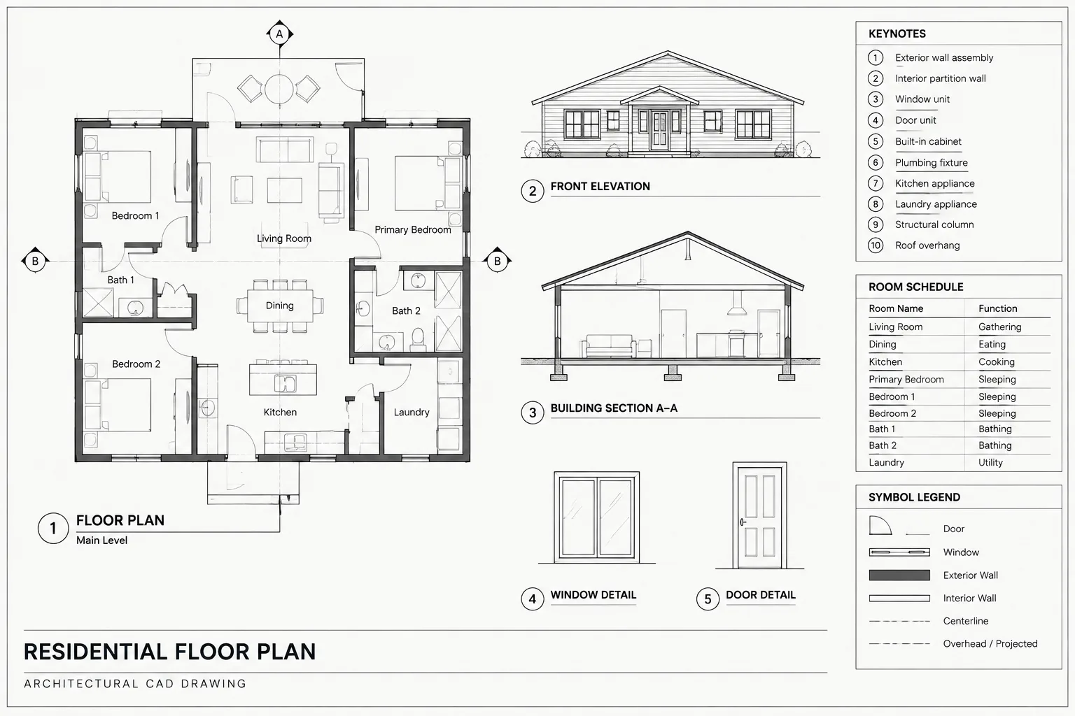
Readable annotation depends on more than choosing a font. Architectural CAD text styles must work with drawing hierarchy, plotting, layers, dimensions, leaders, schedules, blocks, and the way files move between project participants.
This guide presents a practical workflow for creating a restrained text system that remains understandable across plans, elevations, sections, details, and sheet-based documentation. It also explains how to review imported DWG content without disrupting attributes or other dependent annotation objects.
Text is one of the most frequently repeated elements in an architectural drawing set. Room names, dimensions, keynotes, detail labels, schedules, and general notes may serve different purposes, but they still need to look like parts of the same document. Without a deliberate text-style system, drawings quickly develop inconsistent fonts, unpredictable plotted sizes, duplicate styles, and annotations that compete with the geometry.
A practical architectural CAD text system does not require a large collection of styles. It requires a small, controlled set of roles, a reliable approach to plotted size, and clear rules for where each type of annotation belongs. The goal is not visual decoration. The goal is to make information easy to find, read, and coordinate throughout the drawing set.
Separate text appearance from annotation purpose
A CAD text style generally controls the underlying typeface and related text characteristics. The purpose of the annotation, however, may also depend on its layer, height, color, lineweight behavior, and relationship to other objects.
For example, a room name and a general note may use the same typeface while differing in plotted size and placement. A detail title may use a contrasting weight or capitalization pattern, while a dimension string may obtain its text settings from a dimension style rather than from manually placed text.
This distinction helps prevent a common mistake: creating a new text style for every annotation variation. If every room, scale, sheet type, or note category receives a separate style, the drawing becomes difficult to maintain. Styles should represent stable typographic needs, while layers and object settings should handle project-specific organization.
Build an annotation hierarchy before creating styles
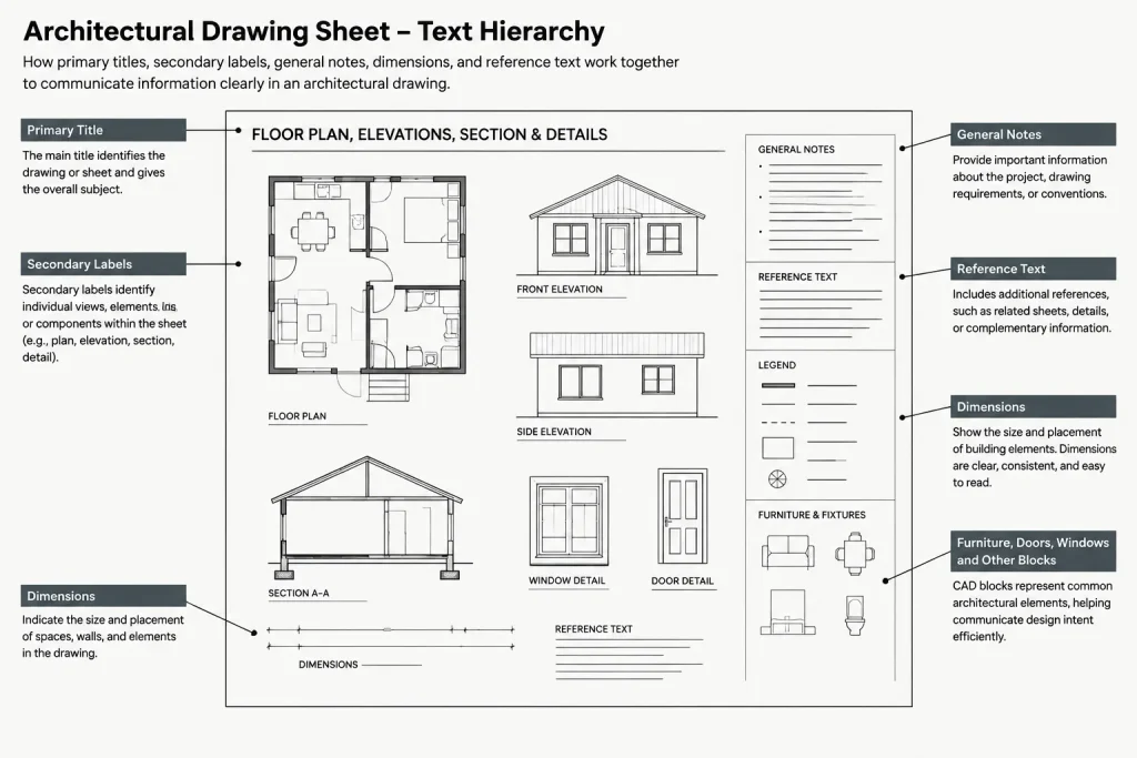
Start by identifying the information levels that appear across the project. Most architectural sets need a hierarchy similar to the following:
| Annotation role | Typical use | Visual objective |
|---|---|---|
| Primary titles | Drawing titles, major view labels, schedule headings | Establish the strongest text level on a sheet |
| Secondary labels | Room names, elevation labels, section labels, enlarged-area headings | Identify important drawing content without overpowering titles |
| General annotation | Keynotes, plan notes, material labels, short instructions | Provide the main readable body text |
| Dimensions | Dimension strings, levels, coordinates where applicable | Remain compact, consistent, and clearly associated with geometry |
| Reference information | Cross-references, secondary identifiers, supporting schedule text | Stay legible while remaining visually subordinate |
The exact names can vary by office or project. What matters is that every annotation category has a defined role. When two categories have no meaningful visual difference, they may not need separate formatting.
Choose a controlled typeface strategy
Select typefaces that remain clear when plotted, reproduced, and viewed as reduced digital sheets. Highly decorative lettering may look acceptable at a large screen magnification but become difficult to read in a complete drawing set.
Before adopting a typeface, confirm that intended project participants can access it and that exported files preserve an acceptable appearance. Missing font files can cause substitution, altered spacing, wrapping changes, and misaligned schedule content. A conservative typeface strategy is especially useful when DWG files move between architects, consultants, contractors, and clients.
If a project uses more than one typeface, assign each one a specific function. For example, a contrasting face might be reserved for titles while a simpler face handles notes and dimensions. Avoid switching fonts merely to create variety.
Plan for plotted size, not screen appearance
Architectural annotations should be evaluated according to how they appear on the final sheet. Screen zoom is not a reliable measure because users can enlarge or reduce the view at any time.
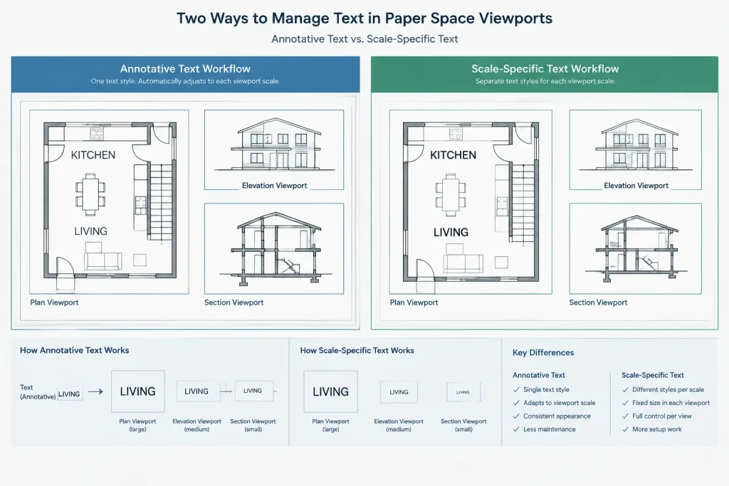
There are two common ways to manage text across drawing scales:
Annotative workflow
Annotative text can display at a consistent paper-oriented size when assigned to supported annotation scales. This approach can reduce repeated text where the same model information appears in viewports at different scales. It still requires careful management. Unnecessary scales, misplaced text, or inconsistent object settings can produce confusing results.
Scale-specific workflow
Some drawing standards use non-annotative text sized for a particular view or drawing scale. This can be straightforward when views are clearly separated and their scales do not change often. It may require duplicate annotation when the same geometry appears at several scales.
Either method can work. Problems arise when both methods are mixed without a documented rule. Choose a primary workflow for each file or project, then test representative sheets before producing large amounts of annotation.
Coordinate text styles with related CAD standards
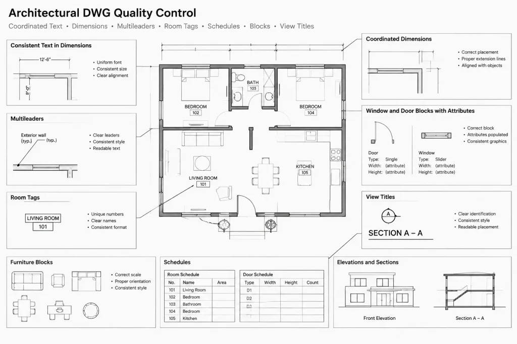
Text styles should not be developed in isolation. Review how they interact with the other systems that generate or contain text:
- Dimension styles: Confirm the intended text style, placement, spacing, and plotted hierarchy.
- Multileader styles: Coordinate note text, leader landing behavior, and content spacing.
- Tables and schedules: Define clear distinctions between headings, column labels, and body entries.
- Blocks and attributes: Check tag text, room information, equipment identifiers, and title block fields.
- View titles and callouts: Ensure drawing names, reference numbers, and sheet references form a consistent family.
- Layers: Place annotation on layers that support visibility control, plotting, and discipline coordination.
A text style may be correct by itself but still create an inconsistent sheet if dimension styles and block attributes use unrelated settings. Coordination across these systems is more important than the number of available styles.
Use naming that explains function
Text-style names should help another drafter understand their intended use. Names based only on a font file provide little guidance because the same typeface may support several annotation roles.
A useful naming convention can identify the office or project family, annotation role, and any meaningful behavior such as annotative use. Keep the naming structure short enough to scan in a style list. Avoid embedding temporary drawing scales or individual sheet references unless the workflow genuinely depends on them.
Before renaming or deleting an existing style, determine where it is used. Text styles may be referenced by dimensions, leaders, tables, attributes, or objects that are not visible in the current view.
Control capitalization, wording, and spacing
Graphic consistency is only one part of readable annotation. Establish editorial conventions for capitalization, abbreviations, punctuation, and repeated terminology. If one plan uses full room names while another uses unexplained abbreviations, matching fonts will not make the set feel coordinated.
Use capitalization deliberately. All-capital notes may support an established office standard, but they should not be used as a substitute for hierarchy. Likewise, excessive width adjustments, oblique angles, or compressed lettering can reduce readability and complicate editing.
Keep text clear of wall lines, hatches, dimensions, symbols, and other notes. A readable typeface cannot compensate for poor placement. Where notes are crowded, reorganize the annotation or use a keyed-note system rather than shrinking text until it fits.
Audit imported and downloaded DWG content
Downloaded CAD blocks and consultant files often introduce additional text styles. Some are necessary because they support a specific block or discipline standard; others are unused remnants.
When reviewing imported content:
- Inspect visible text and attributes before changing style assignments.
- Check whether substitutions alter wrapping, alignment, or symbol appearance.
- Confirm that block attributes remain editable and properly positioned.
- Identify styles referenced by dimensions, tables, and leaders.
- Remove unused definitions only after verifying that they are not required.
- Avoid forcing consultant annotation into the architectural standard when it must remain recognizable as consultant information.
Cleaning should improve reliability without damaging the source content. Work in a controlled copy when testing broad style changes.
Test the system on a complete sample sheet
A text hierarchy should be judged in context, not through isolated labels. Create or select a representative sheet containing a plan, dimensions, notes, room labels, callouts, a title, and supporting references. Plot or export the sheet using the intended output process, then review it at normal reading size.
Check whether the drawing title is easy to locate, whether general notes are comfortably readable, and whether secondary labels remain subordinate. Look for text hidden by dense linework, inconsistent spacing around leaders, and headings that dominate more than intended. Also test a reduced reproduction because drawing sets are frequently viewed or printed smaller than their original sheet format.
Maintain text standards throughout the project
Once the text system is established, include it in the project template or approved seed files. Document the intended role of each style so that team members do not create near-duplicates whenever a drawing presents a new condition.
Periodic audits are useful before major drawing issues. Review style lists, search for substituted fonts, compare annotation across sheet types, and inspect recently imported details or blocks. Correcting inconsistencies during production is easier than rebuilding the hierarchy immediately before issuance.
A successful architectural CAD text standard is intentionally modest. It uses a limited style family, a clear hierarchy, a consistent scaling method, and coordinated dimension, leader, table, and block settings. The result is not simply cleaner typography; it is a drawing set that communicates more quickly and is easier for the entire project team to maintain.
A practical review sequence for CAD text standards
When refining an existing drawing set, begin with the annotations visible on completed sheets rather than immediately editing the style list. The plotted result reveals hierarchy and coordination problems that style names alone cannot show.
- Map annotation roles: Identify titles, labels, notes, dimensions, references, schedule content, and block attributes.
- Trace style dependencies: Determine which text settings are controlled directly and which are inherited through dimension, multileader, table, or block definitions.
- Compare similar sheets: Look for equivalent annotations that differ in appearance, capitalization, spacing, or placement.
- Review plotting behavior: Confirm that text remains distinct from dense geometry, hatches, leaders, and nearby symbols.
- Investigate duplicates: Check whether similarly named styles serve a real purpose or were introduced through copied and imported content.
- Test changes safely: Apply broad replacements in a controlled copy and inspect attributes, wrapping, alignment, schedules, and references before updating production files.
How to diagnose common text problems
If annotation changes appearance between workstations or exported sheets, investigate font availability and substitution before changing object placement. If text appears at inconsistent plotted sizes, review the annotation-scaling method and viewport context. If style lists are crowded, trace dependencies before removing definitions. If notes are technically legible but difficult to scan, examine hierarchy, spacing, wording, and conflicts with drawing geometry.
The most reliable standard is not necessarily the one with the most controls. It is the one that team members can understand, apply consistently, and verify through the project output process.
Frequently asked questions about architectural CAD text styles
What is the difference between a text style and an annotation role?
A text style defines underlying typographic characteristics. An annotation role describes how text functions in the drawing, such as a title, room label, general note, dimension, or reference. Several roles may share a text style while using different object settings or layers.
Should every annotation category have its own text style?
Not necessarily. Separate styles are useful when there is a stable typographic difference. Layer assignments, object properties, and dependent styles can handle many organizational differences without creating additional text-style definitions.
Why does text change when a DWG file is opened elsewhere?
A required font may be unavailable, causing substitution. The replacement can affect character width, line wrapping, alignment, and schedule layout. Font access and output testing should therefore be part of file coordination.
Can annotative and scale-specific text be used in the same project?
They can coexist, but the intended workflow should be documented. Unplanned mixing makes plotted size harder to predict and can lead to duplicate or misplaced annotation.
Why can deleting an apparently unused text style cause problems?
A style may be referenced by dimensions, leaders, tables, block attributes, or objects outside the current view. Dependencies should be checked before a style is renamed, reassigned, or removed.
How should imported CAD blocks be handled?
Inspect visible text and editable attributes before standardizing them. Confirm that replacement settings do not alter alignment, wrapping, symbols, or the intended identity of consultant information.