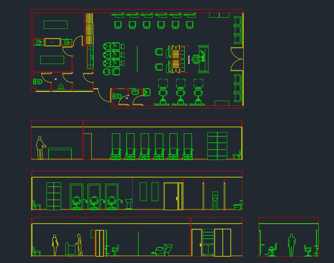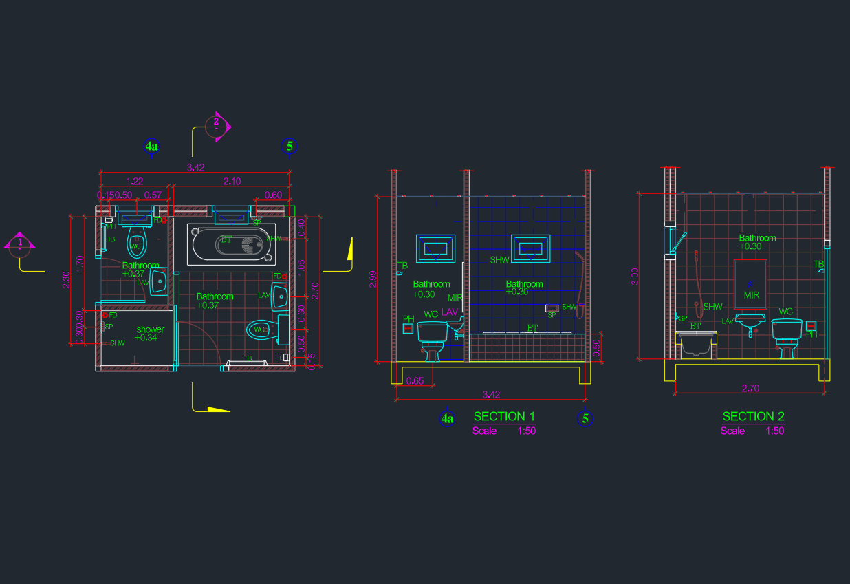
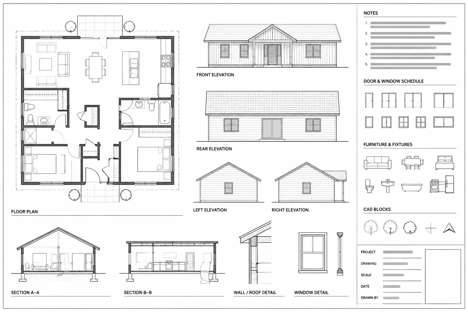
Architectural CAD sheet composition connects drafting accuracy with visual communication. Even when every plan, elevation, section, and note is correct, an unclear arrangement can make relationships difficult to recognize and references slow to follow.
This guide explains how to evaluate a sheet as a complete information system rather than as a collection of separate viewports. It focuses on hierarchy, drawing relationships, annotation space, alignment, and the deliberate use of open areas.
A technically accurate drawing can still be difficult to use when its sheet is crowded, fragmented, or visually unbalanced. Architectural CAD sheet composition is the process of arranging drawing views, annotations, schedules, and supporting information so readers can quickly understand both the content and its hierarchy.
Good composition is not merely graphic styling. It affects plan reading, cross-referencing, review, plotting, and construction communication. The goal is to make the drawing sequence feel deliberate: primary information should be easy to find, related views should appear together, and enough open space should remain for legibility.
Begin with the sheet’s purpose
Before creating viewports or placing notes, define what the sheet needs to communicate. A floor plan sheet, elevation sheet, enlarged-plan sheet, and detail sheet each have a different visual center of gravity.
Ask these questions at the start:
- What is the primary drawing on the sheet?
- Which supporting views are necessary to understand it?
- What information belongs on another sheet rather than here?
- Which view should a reader notice first?
- How will this sheet relate to the sheets immediately before and after it?
A clear purpose prevents the sheet from becoming a collection of unrelated items placed wherever space happens to be available.
Establish a visual hierarchy
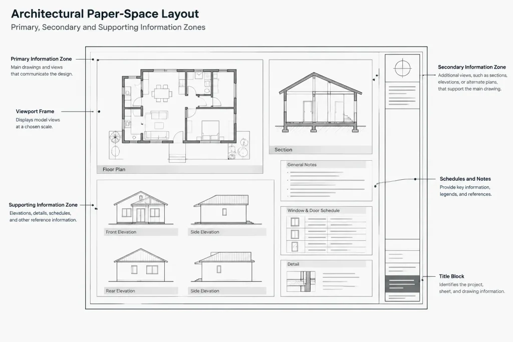
Most architectural sheets benefit from three levels of information: a primary view, secondary views, and reference material. The primary view usually occupies the most prominent area and establishes the sheet’s subject. Secondary views explain portions of that subject. Notes, legends, schedules, and diagrams support the drawings without competing with them.
| Information level | Typical content | Composition goal |
|---|---|---|
| Primary | Overall plan, major elevation, building section, or principal enlarged view | Make it easy to identify immediately |
| Secondary | Related elevations, sections, diagrams, or additional plan areas | Place close to the primary view and maintain a logical reading order |
| Supporting | Notes, legends, schedules, key plans, and reference graphics | Keep accessible without overpowering the drawings |
Hierarchy comes from more than view size. Position, lineweight, title placement, spacing, and alignment all influence what readers see first.
Plan the sheet before refining the drawings
A common CAD workflow is to finish every view and then attempt to fit everything onto a sheet. This often produces awkward gaps, undersized drawings, or last-minute changes in scale. A better approach is to develop a rough sheet layout early.
Create preliminary viewport boundaries or simple placeholders for the expected content. Include approximate areas for notes, legends, schedules, and revision information. The placeholders do not need to be precise; they are planning tools that reveal whether the proposed sheet can support the intended content.
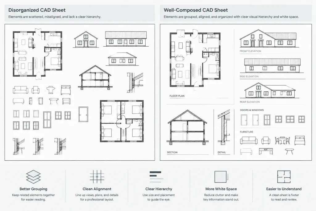
Early composition studies can also show when a sheet should be divided. If every view must be reduced significantly or pushed against another item, the issue may be the quantity of information rather than inefficient placement.
Organize views around drawing relationships
Views should be grouped according to how they are used, not simply according to available space. An enlarged plan and its interior elevations generally work better when they appear near one another. A wall section is easier to follow when related details are placed in a predictable adjacent zone or on a clearly referenced detail sheet.
Use a consistent reading direction
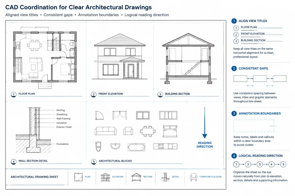
Arrange views so the reader can move through the sheet in a stable direction. Depending on the office convention and sheet content, this may be across rows, down columns, or from a dominant view toward supporting views. Avoid layouts that force the reader to jump repeatedly between opposite corners.
Preserve useful orientation
Whenever practical, keep related plans at a consistent orientation. Rotating a view solely to fill an empty area can make cross-referencing harder. If a rotation is necessary, provide clear orientation information and check that text remains readable in the plotted sheet.
Keep dependent views close
A section, elevation, or detail that explains a specific portion of another drawing should be visually associated with it when the sheet structure permits. Proximity does not replace a proper callout, but it reduces search time and reinforces the relationship.
Use alignment as an organizing tool
Aligned edges make a sheet appear controlled even when the views differ in shape. View titles, viewport boundaries, note columns, schedules, and diagrams can share common horizontal or vertical reference lines.
Useful alignment strategies include:
- Starting multiple view titles along the same baseline.
- Aligning the edges of stacked elevation views.
- Using consistent gaps between related details.
- Keeping note columns within a defined band.
- Aligning schedules with nearby viewport edges where practical.
Avoid forcing every object into a rigid grid when the drawing geometry does not support it. The grid should organize the information, not distort view scales or create unnecessary empty zones.
Treat white space as functional space
White space is the unoccupied area around views and annotations. It separates subjects, clarifies groups, and gives dense linework room to remain readable. Filling every open area with a note, diagram, or additional detail may increase the amount of information while reducing the sheet’s usefulness.
Evaluate white space at three levels:
- Within a view: Dimensions, tags, and leaders should not compress the drawing’s geometry.
- Between views: Separate unrelated drawings enough that their annotations do not appear connected.
- Around sheet elements: Keep content from crowding the title block, border, or other fixed sheet information.
Uneven white space can also signal a composition problem. A large isolated void beside a congested cluster may indicate that the view arrangement should be reconsidered rather than simply filled.
Coordinate annotations with the composition
Annotation is part of the layout, not a layer added after view placement. Dimensions, room tags, keynotes, section marks, and leaders can substantially change the apparent size of a viewport.
When testing the sheet, display representative annotations instead of composing around bare geometry. A floor plan that appears to fit comfortably may become crowded after exterior dimensions and reference symbols are added.
Keep annotation styles visually consistent across the sheet. View titles with varying offsets, note blocks with different spacing, or symbols at inconsistent plotted sizes weaken the hierarchy. Consistency allows the reader to recognize information types without studying each item individually.
Manage notes, legends, and schedules carefully
Supporting information often expands during a project. Reserve a logical area for it, but do not create an oversized empty note field based only on uncertain future content.
General notes and legends should be placed where users can find them consistently. View-specific notes are usually more useful near the drawing they describe. Schedules should remain readable and should not be squeezed into narrow leftover spaces merely to keep them on a preferred sheet.
Before moving a schedule or note block to another sheet, consider how often the reader must compare it with the associated drawings. Sheet organization should support coordination rather than satisfy composition alone.
Compose for plotted output, not only the screen
CAD users can zoom indefinitely, but printed and exported sheets have fixed boundaries. Review the composition at the intended sheet size and through the actual plotting workflow. Check lineweights, text readability, screened information, hatch density, and the visual prominence of viewport content.
A useful test is to view the entire plotted sheet at once. The primary drawing should remain identifiable even when individual notes are too small to read on screen. Then inspect dense areas at closer range to find collisions, clipped annotations, and weak line separation.
Common sheet composition problems
Views are placed by leftover space
This produces weak relationships and unpredictable reading order. Reorganize views by subject and dependency before trying to maximize area usage.
Every view competes equally
When all drawings have similar prominence, readers cannot identify the sheet’s main subject. Establish a primary view and let supporting content remain subordinate.
Annotations cross visual boundaries
Dimensions, leaders, or tags that extend toward another viewport can make separate drawings appear connected. Adjust viewport spacing or relocate annotations without obscuring their intended references.
The sheet is technically full but visually empty
Scattered small items can occupy the whole page while lacking structure. Group related items and consolidate open areas rather than distributing views evenly without purpose.
The sheet is overloaded
Reducing every view is not always the solution. Consider whether the information should be separated into another coordinated sheet, especially when different drawing types serve different tasks.
A practical CAD sheet composition workflow
- Define the sheet’s subject and primary drawing.
- List the required supporting views, notes, legends, and schedules.
- Create rough placeholders in paper space.
- Group related views and establish a reading direction.
- Apply intended viewport scales and representative annotation.
- Align titles, view edges, and supporting information.
- Review white space and separate unrelated content.
- Check references to other sheets and confirm view identifiers.
- Plot or export a test sheet using the project’s established settings.
- Review the complete sheet and dense areas before issue.
Final review questions
Before accepting the layout, ask whether a person unfamiliar with the sheet can identify its purpose, locate the primary drawing, and follow references without unnecessary searching. Confirm that view titles are associated with the correct drawings, supporting information is easy to find, and no content appears accidentally clipped or stranded.
Effective architectural CAD sheet composition makes complex information feel orderly. By planning early, grouping related views, aligning elements, protecting white space, and reviewing the plotted result, drafters can create sheets that are easier to navigate, coordinate, and use.
Evaluate composition separately from drawing accuracy
A technical review asks whether the drawings and references are correct. A composition review asks whether readers can find, compare, and interpret that information efficiently. Keeping these reviews distinct can reveal layout problems that are easy to overlook while concentrating on geometry or annotation content.
During a composition review, temporarily ignore minor drafting edits and study the entire sheet. Look for the first view that attracts attention, the path between related drawings, and any areas where notes or symbols blur the boundary between subjects.
Use a reduced-view check
When the sheet is viewed as a whole, fine text becomes less prominent and the broader visual structure becomes easier to assess. Dense clusters, isolated drawings, inconsistent title positions, and unbalanced note fields are often more apparent at this stage.
Use a dependency check
Identify each view that depends on another drawing for context. Confirm that the relationship is supported by proximity, a predictable reading sequence, or clear referencing. A visually attractive arrangement can still be inefficient if frequently compared items are separated without a communication benefit.
Use a change-tolerance check
Consider how the layout will respond if annotations expand, a schedule gains content, or a drawing boundary changes. The goal is not to reserve excessive blank space, but to avoid a composition so tightly packed that routine coordination disrupts the entire sheet.
Separate intentional white space from unused space
Intentional white space creates separation, protects annotations, and clarifies groups. Unused space has no clear compositional role and may result from scattered placement or weak alignment. The distinction depends on what the open area does for the reader.
- Keep it when it separates unrelated subjects or protects a dominant view.
- Reorganize it when it appears as an isolated gap beside congested content.
- Do not fill it automatically with unrelated details merely because room is available.
Review the sheet as part of a drawing set
A sheet should work on its own while remaining consistent with adjacent sheets. Similar information should appear in predictable locations where practical, and references should lead readers through the set without forcing them to relearn the layout on every page.
Before issue, compare the sheet with neighboring plan, elevation, section, or detail sheets. Check whether titles, note zones, orientation practices, and supporting graphics follow an understandable pattern. Consistency should support navigation without forcing every sheet into an identical arrangement.
Architectural CAD sheet composition FAQ
Should every open area on a CAD sheet be filled?
No. Open space can separate drawing groups, protect annotation, and reinforce hierarchy. Add content only when it belongs on the sheet and improves communication.
How do I decide which drawing should dominate the sheet?
Choose the view that best communicates the sheet’s primary purpose. Supporting views, notes, and schedules should clarify that subject rather than compete with it.
Is a strict grid always the best layout method?
A grid can improve alignment and reading order, but it should remain flexible. Forcing irregular views into a rigid arrangement may create awkward gaps, reduce useful drawing space, or weaken relationships.
When should content move to another sheet?
Consider a coordinated additional sheet when drawings must be reduced excessively, annotations begin to collide, unrelated subjects compete for attention, or the intended reading sequence becomes difficult to follow.
Why should representative annotations be shown during layout planning?
Dimensions, tags, leaders, callouts, and titles affect the actual space required by a view. Composing around bare geometry can produce a layout that no longer works once annotation is displayed.
How can I tell whether white space is helping the composition?
Useful white space clarifies groups, separates unrelated information, and gives dense linework room to remain legible. If an open area merely isolates content while another area is crowded, the arrangement may need revision.
Should related plans remain in the same orientation?
Consistent orientation generally makes comparison and cross-referencing easier. If a view must be rotated, its orientation and text should remain clear in the plotted output.