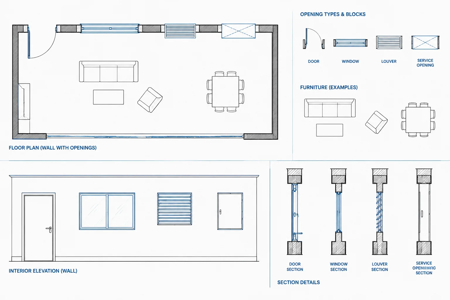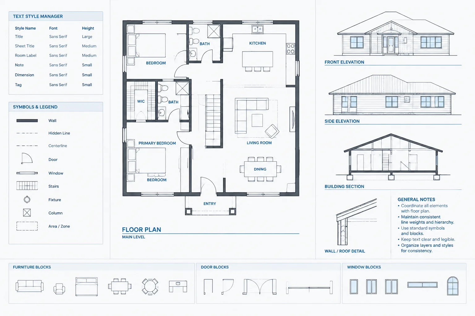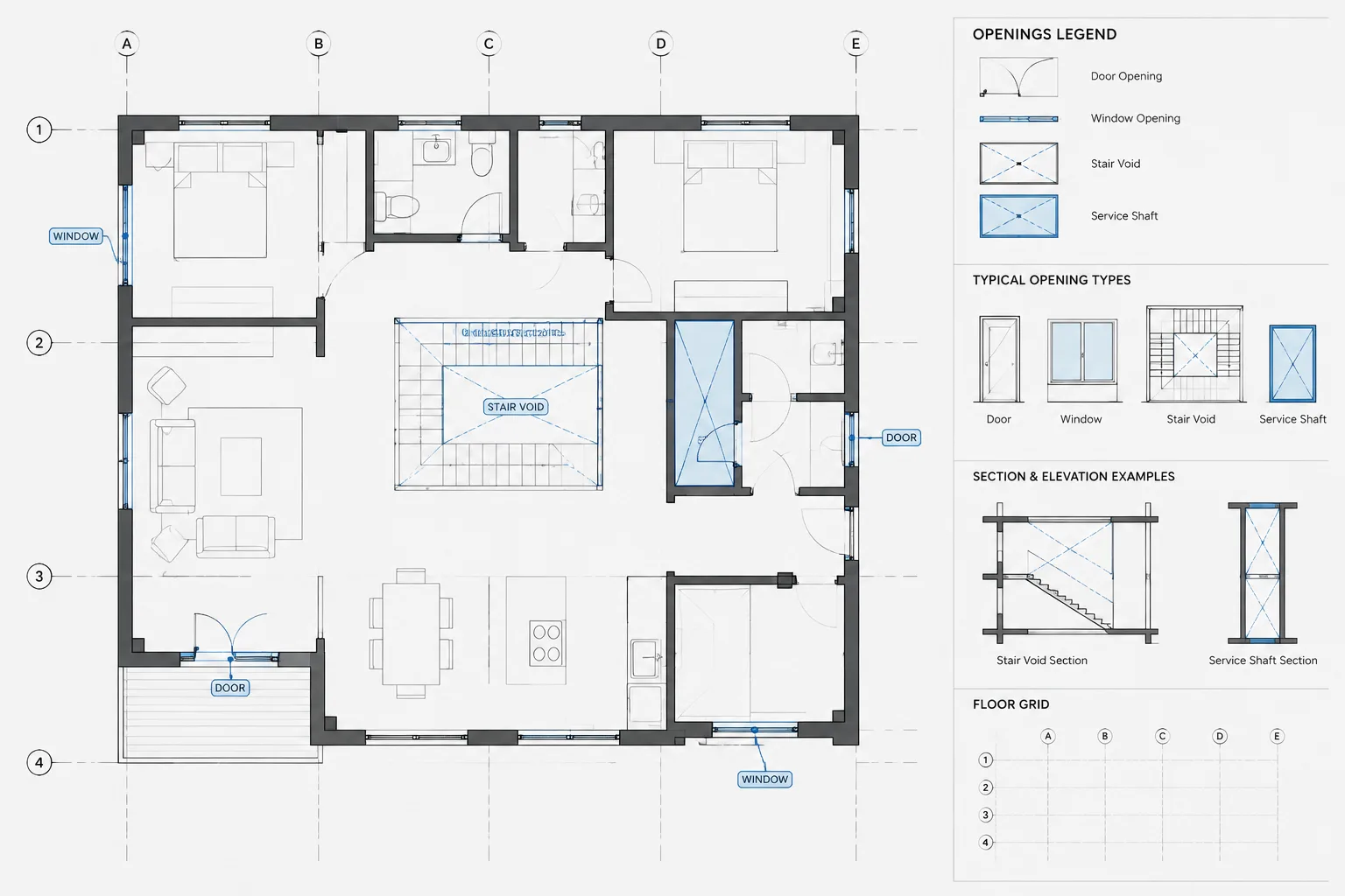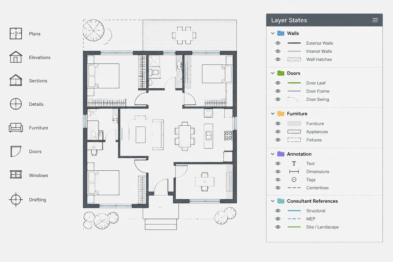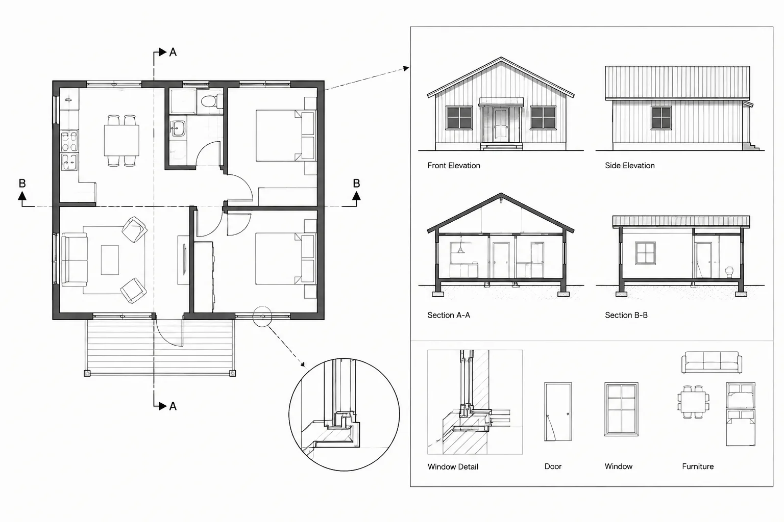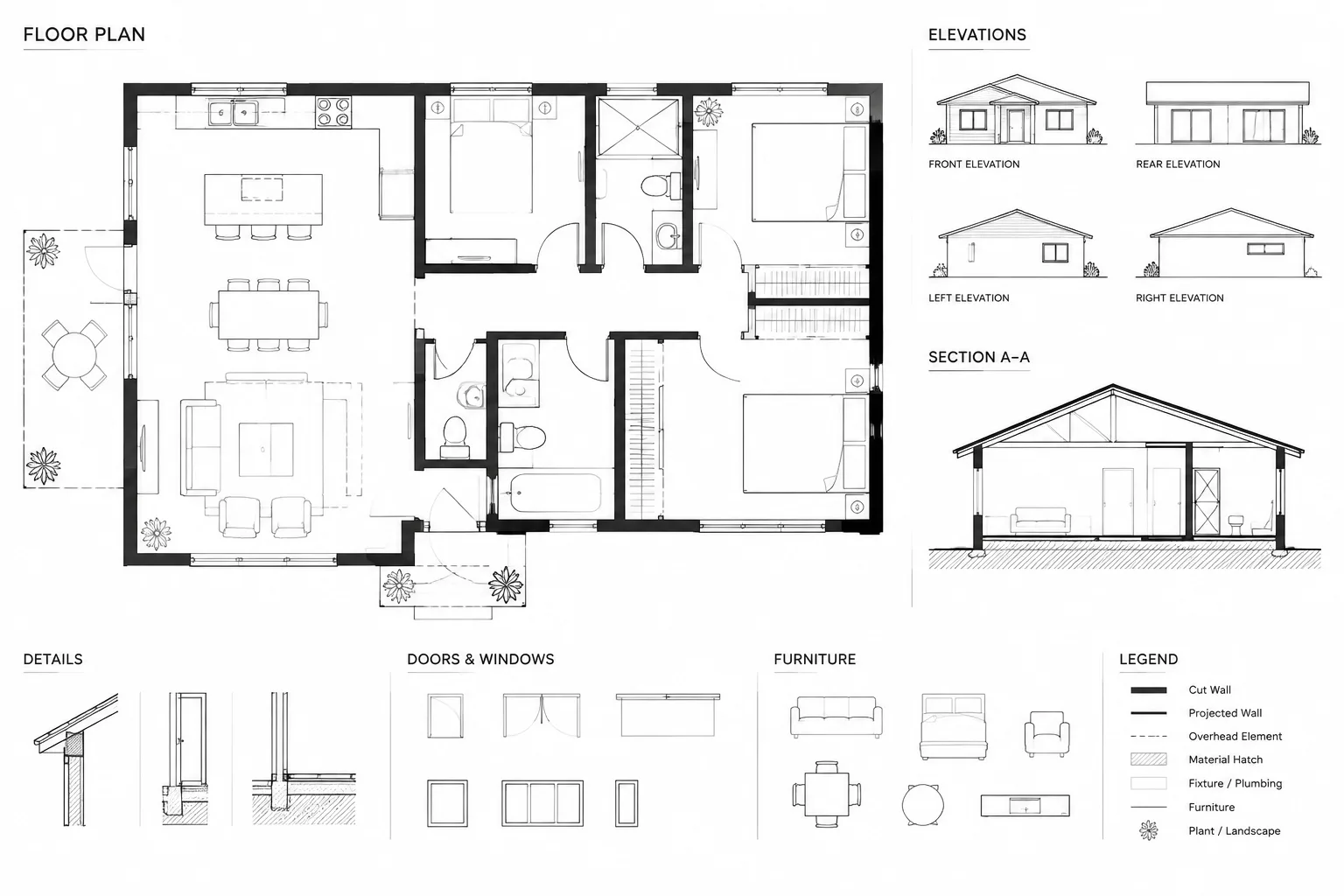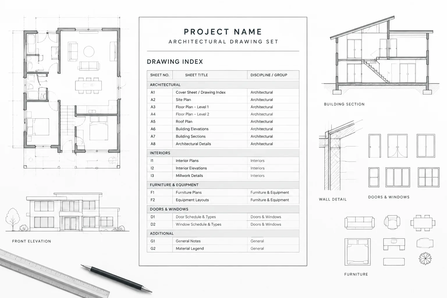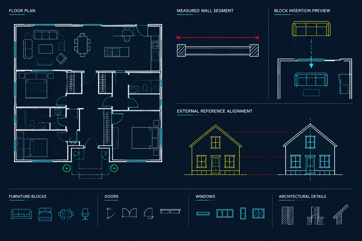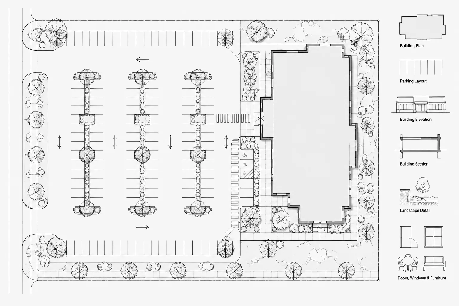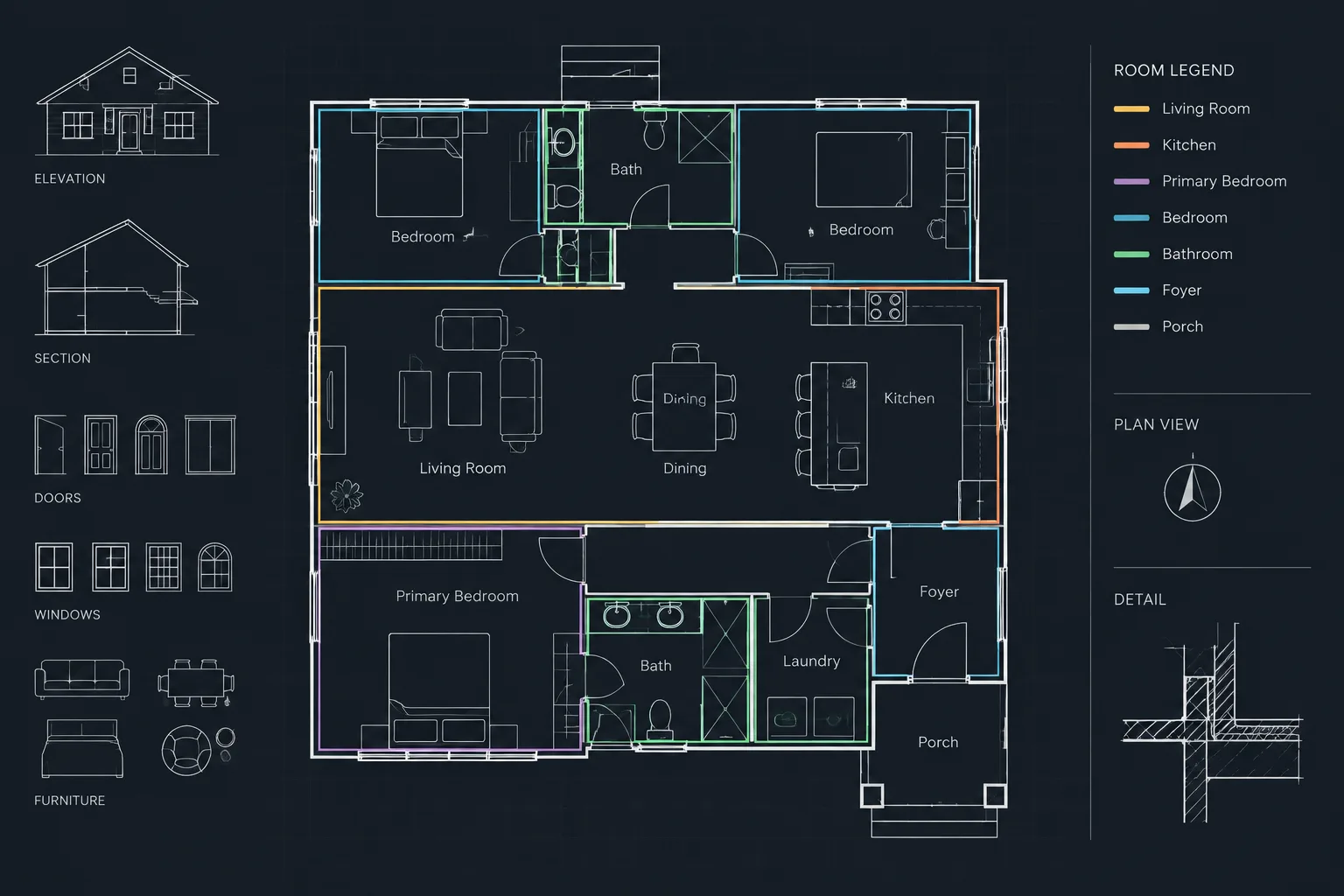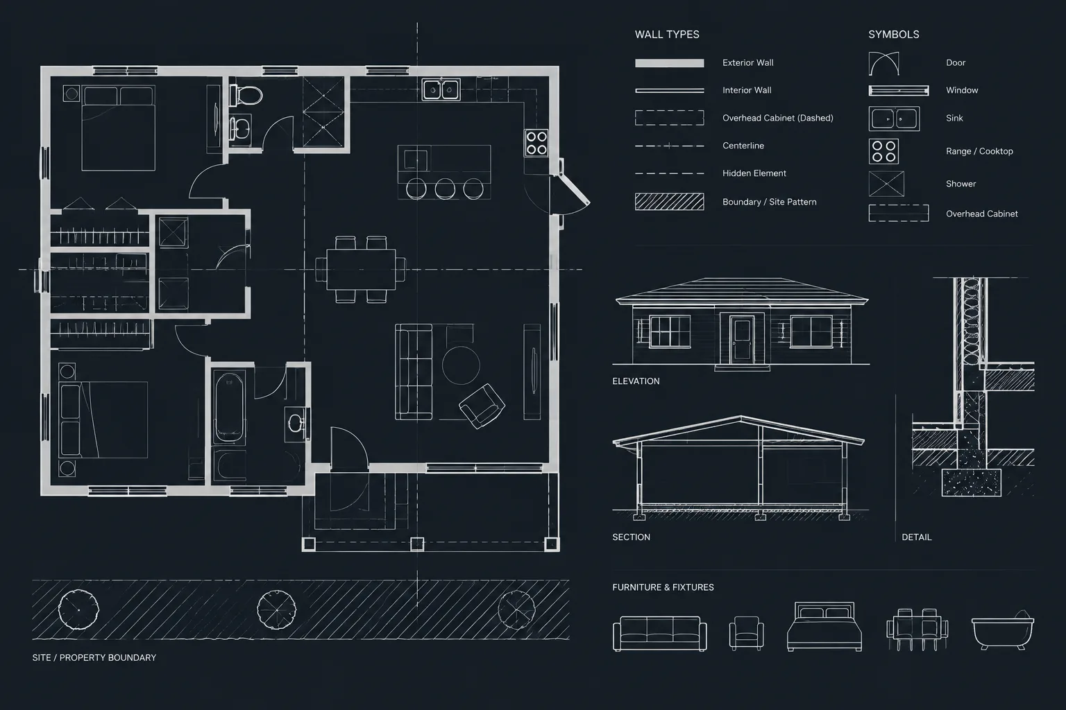
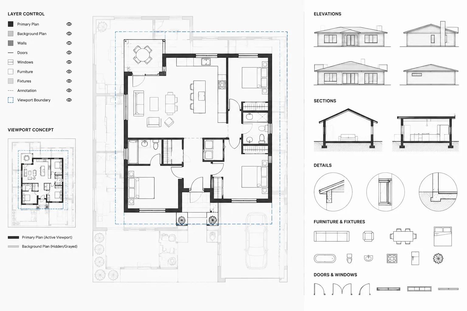
Clear architectural sheets depend on more than accurate geometry. They also need a visual hierarchy that distinguishes the drawing’s purpose from the information included only for context. Halftone backgrounds provide that separation, helping readers follow primary scope without losing the walls, openings, fixtures, or site elements needed for orientation.
The workflow matters as much as the appearance. A background that looks subdued in the CAD workspace may behave differently in a layout or published file. Effective control therefore begins with organized layers and object properties, continues through viewports and plot styles, and ends with review of the actual deliverable.
Architectural drawings often need to show information that is important for context but secondary to the sheet’s main purpose. A reflected ceiling plan may need walls and doors as a background. A furniture plan may retain partitions, room names, and selected fixtures. A consultant coordination plan may show the architectural base beneath discipline-specific work.
If all of that information plots with equal visual weight, the drawing becomes difficult to read. Halftoning solves this problem by making background geometry visually quieter while keeping the primary scope prominent. The challenge is that a dependable halftone is not simply a lighter object color on screen. It is a coordinated result involving object properties, layer controls, plot styles, viewports, and final PDF output.
This guide explains how to build halftone backgrounds in architectural CAD without weakening the source model or creating a collection of hard-to-find object overrides.
What Is a Halftone Background?
A halftone background is contextual drawing information plotted with reduced visual emphasis. Depending on the office workflow and output method, that effect may be produced through screened plot styles, lighter plotted colors, viewport layer overrides, or a dedicated background layer system.
The background remains legible enough to establish location and orientation, but it should not compete with the information the sheet is intended to communicate.
Common examples include:
- Walls and openings behind reflected ceiling information
- Architectural floor plans beneath consultant layouts
- Existing construction behind proposed work
- Floor-plan context behind furniture or equipment
- Adjacent levels or areas shown for orientation
- Site information beneath a focused paving or landscape layout
Halftone is a graphic hierarchy tool, not a substitute for deciding what belongs on a drawing. Unnecessary information should usually be turned off rather than made faint.
Screen Appearance and Plot Appearance Are Different
One of the most common CAD mistakes is approving a background because it looks subdued in model space. Display fading, reference fading, dark interface backgrounds, and monitor settings can all affect what a user sees. Those conditions do not necessarily determine how the geometry will plot.
A reliable workflow evaluates at least three separate conditions:
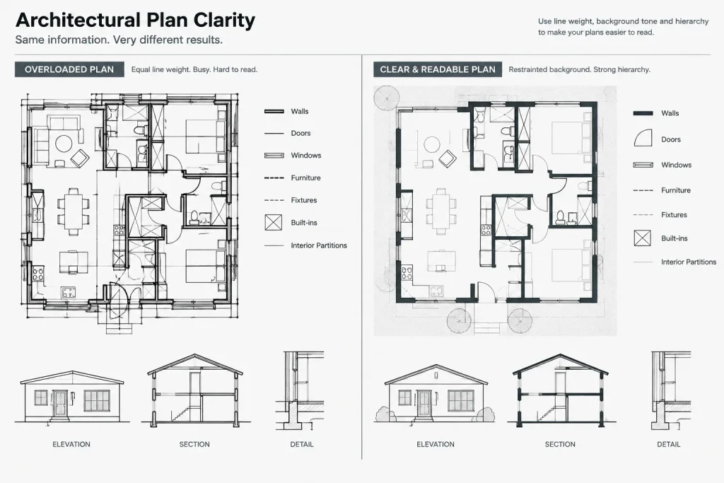
- Editing display: How the drawing appears while users work in the DWG
- Layout preview: How layer and viewport controls affect the sheet
- Published output: How the final PDF or physical print reproduces the hierarchy
The PDF is the meaningful quality-control result. A line that appears pleasantly gray on screen may become nearly invisible when printed, while another may reproduce darker than expected. Always judge halftones at the intended sheet scale and through the project’s actual publishing process.
Choose a Halftone Control Method
There is no single method suitable for every CAD environment. The best choice depends on whether the project uses color-dependent or named plot styles, how backgrounds are referenced, and whether the same source geometry must appear differently on different sheets.
| Method | Best use | Main caution |
|---|---|---|
| Plot-style screening | Consistent office-wide plotting based on assigned colors or named styles | Objects must follow the expected plotting assignments |
| Viewport layer overrides | Making the same model appear differently on separate sheets | Overrides can be missed during troubleshooting or viewport replacement |
| Dedicated background layers | Drawings with clearly separated primary and contextual content | Duplicating geometry can create coordination problems |
| Lighter plotted colors | Workflows designed around controlled grayscale output | Color selection alone may not produce predictable results in every plot configuration |
| Object-level overrides | Exceptional local corrections | Scattered overrides are difficult to audit and maintain |
Layer-based and viewport-based methods are generally easier to review than individual object changes. Object overrides should be limited to intentional exceptions, not used as the primary system.
A Practical Halftone Workflow
1. Identify the sheet’s primary message
Before changing graphics, state what the drawing is meant to communicate. On a furniture plan, furniture and relevant tags may be primary. On a ceiling plan, ceiling boundaries, grids, fixtures, and ceiling annotations take priority. The wall background supports those elements but should not dominate them.
This simple decision prevents indiscriminate fading. Some architectural elements may still need normal emphasis because they define a boundary, opening, or coordination constraint.
2. Remove irrelevant background content
Start by turning off information that does not help the sheet. Dense hatch patterns, dimensions from another plan type, construction notes, redundant room data, overhead geometry, and minor details can make even a light background visually noisy.
A clean background usually performs better than a complete base plan plotted faintly. Use layer visibility and reference controls to simplify the view before adjusting line intensity.
3. Keep source objects property-driven
Architectural base geometry should normally retain controlled layer assignments and standard object properties. Avoid opening a referenced floor plan and recoloring large groups of objects solely for one receiving sheet. That change may damage the appearance of other drawings using the same source.
Where possible, control the background from the host drawing or sheet viewport. This keeps the architectural base reusable and lets each drawing type establish its own hierarchy.
4. Apply the effect at the highest manageable level
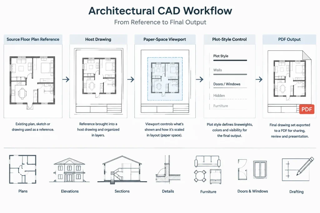
Use a predictable hierarchy of control. Begin with plot-style rules and layers, then use viewport overrides when a sheet requires a different appearance. Reserve object-level corrections for cases that cannot be handled cleanly at a broader level.
For an externally referenced plan, viewport layer overrides can provide sheet-specific control without editing the referenced DWG. Relevant reference layers can be assigned the project’s established background plotting treatment within that viewport.
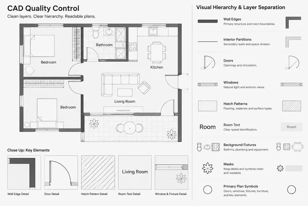
5. Preserve essential edges and symbols
Not every element in a background reference should necessarily receive identical treatment. Major wall boundaries, openings, stairs, structural grids, or other orientation elements may require more visibility than finish patterns and secondary fixtures.
Create a small number of intentional hierarchy levels rather than many nearly indistinguishable shades. The reader should immediately understand which information is primary, supporting, or merely contextual.
6. Test the actual PDF
Publish a representative sheet using the project page setup and plot-style configuration. Review it at a normal reading size, then zoom in to inspect fine geometry. If printed sheets are part of the deliverable, make a physical test using the expected output process.
Check whether the background:
- Remains visible without overpowering primary work
- Retains important wall and opening relationships
- Avoids merging into dense gray areas
- Does not disappear behind hatches, masks, or filled objects
- Reproduces consistently across different sheet viewports
Halftoning Xrefs Without Editing the Source
Referenced architectural backgrounds are a common reason to use halftone controls. The receiving drawing may need a quieter version of the plan, but the source must remain suitable for architectural floor-plan sheets.
First, confirm that the xref geometry is organized on useful layers. If walls, doors, furniture, annotation, and hatches are mixed together, the host drawing cannot selectively simplify the reference. Good source-layer organization is therefore part of a successful background workflow.
In the host sheet, turn off irrelevant xref layers and apply viewport-specific property changes to the remaining layers when appropriate. Document those overrides in the project workflow so another drafter understands why the xref does not plot using its original appearance.
Avoid relying only on the visual fade applied to references during editing. That fade helps users distinguish referenced content from current-drawing content, but it should not be assumed to define published output.
Common Problems and Better Fixes
The background is too dark
Confirm that objects are using expected layer properties and plot-style assignments. Look for direct color, lineweight, or plot-style overrides. Also verify that the correct page setup and plotting configuration were used.
The background nearly disappears
Do not compensate by strengthening every background layer. First identify which edges are necessary for orientation. Improve those selected elements while leaving secondary texture subdued or hidden.
Some xref layers plot normally
Check whether those layers received the same viewport treatment as the rest of the reference. New layers added to an xref after the original sheet setup may also require review.
Text and symbols become unreadable
Decide whether the annotation belongs on the receiving sheet at all. If it provides necessary context, it may need a separate graphic treatment from general background geometry. If it duplicates the receiving drawing’s notes or tags, turn it off.
Halftones vary between sheets
Compare page setups, plot-style selections, viewport overrides, and layer states. Similar-looking layouts can publish differently when their plotting controls were created independently. A shared template and a tested sheet setup reduce these inconsistencies.
Quality-Control Checklist
- Define the primary information for the drawing type.
- Hide irrelevant layers before applying halftone treatment.
- Keep source geometry organized and property-driven.
- Use layer or viewport controls instead of widespread object overrides.
- Confirm that xref display fading is not being mistaken for a plot setting.
- Review newly added reference layers before issuing sheets.
- Inspect hatches, masks, fills, and draw order for conflicts.
- Publish using the project’s actual page setup and plot styles.
- Review the final PDF at the intended sheet scale.
- Compare related sheets for consistent hierarchy.
Build Hierarchy, Not Just Lighter Lines
An effective halftone background does more than make objects gray. It separates the drawing’s main message from the information needed to understand that message. The best results come from simplifying the background, preserving selected orientation elements, and applying controls that can be audited at the layer, viewport, and plotting levels.
When the system is planned rather than improvised, one coordinated architectural base can support many drawing types without destructive edits. The resulting sheets are clearer to read, easier to maintain, and more predictable when published.
Managing Halftones as a Drawing-System Decision
Halftoning is most reliable when treated as part of the project’s drawing organization rather than as a final cosmetic adjustment. The team should be able to identify which settings create the background effect, where those settings are applied, and how they can be checked when a sheet does not publish as expected.
A maintainable approach separates three decisions:
- Content: Which referenced or model elements are useful to the sheet?
- Hierarchy: Which elements are primary, supporting, or unnecessary?
- Output: Which layer, viewport, and plotting controls create that hierarchy in the published sheet?
Keeping these decisions separate makes troubleshooting easier. Visibility problems can be addressed without changing the plotting system, while plotting problems can be corrected without unnecessarily editing source geometry.
Coordinate Background Changes Across the Sheet Set
A change to the architectural base can affect furniture, ceiling, equipment, consultant, and site-related drawings differently. When layers are added, renamed, or reorganized, review receiving viewports to confirm that the new content follows the intended graphic treatment. Otherwise, recently added geometry may plot at full emphasis while the established background remains subdued.
Sheet templates and documented layer practices help, but they do not replace visual review. The published output should still be checked for unintended dark objects, missing orientation elements, crowded annotation, and conflicts between backgrounds and primary symbols.
A Focused Troubleshooting Order
When a halftone does not publish correctly, avoid making random object-level changes. Trace the drawing controls in a consistent order:
- Confirm that the correct geometry and reference layers are visible.
- Check whether objects follow their intended layer properties.
- Review viewport-specific overrides and saved layer conditions.
- Verify the page setup and plot-style selection used for publishing.
- Inspect masks, fills, hatches, and draw order that may conceal faint linework.
- Republish and judge the result in the final output rather than relying only on the editing display.
This process preserves the source drawing and reduces the likelihood of hidden exceptions that become difficult to maintain later.
Frequently Asked Questions
Should every object in an architectural background be halftoned?
No. Remove information that does not support the sheet, then assign reduced emphasis to useful context. Important boundaries, openings, grids, or orientation symbols may require a stronger treatment than secondary patterns and fixtures.
Is xref fading the same as plotted halftone?
No. Reference fading is primarily an editing aid that helps distinguish referenced geometry in the workspace. Published appearance depends on the drawing’s layer, viewport, plot-style, and page-setup controls.
Should the referenced DWG be recolored to create a background?
Usually, the receiving drawing or sheet viewport is the better place to control a sheet-specific appearance. Editing the source solely for one sheet can unintentionally affect other drawings that use the same reference.
Why do some background objects still plot dark?
Those objects may have direct property overrides, unexpected layer assignments, different plot-style behavior, or viewport settings that do not match the rest of the background. Recently added xref layers should also be reviewed.
Why does a halftone look acceptable on screen but weak in the PDF?
The editing display and published output are governed by different conditions. Interface colors, display fading, plot styles, line properties, fills, and the publishing process can all affect the result. Use the final output for quality control.
Are object-level overrides ever appropriate?
They can be useful for deliberate local exceptions, but they are difficult to audit when used widely. Layer-based, reference-based, and viewport-based controls generally provide a clearer and more maintainable system.